Vela app
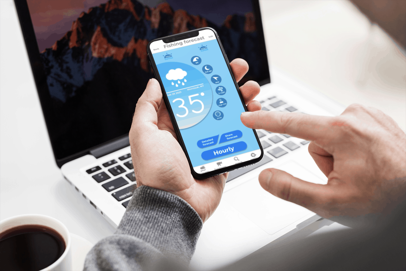
Vela is a fast and easy to read weather forecasting app that you can customize based on your water sport for a fun and safe day in the water. Just forecast and go!
The Story
Most weather forecasting apps take a lot of time to read and understand. They are filled with weather jargon that most people do not understand. People spend less than 5 minutes reading the forecast before deciding to pursue the water activity they planned on.
Weather apps have screens that are cluttered and cramped with information making it unpleasant to look at and read.
The Challenge
Create a fast and easy to read weather forecasting app that users can customize based on their water activity. Design the app with a beautiful interface that’s engaging and enjoyable to look at.
Who it's For
The competitor
The water sport athlete that consistently competes and have to train on a regular basis.
The Hobbyist
The water sport enthusiast who goes out often, most likely with friends or family and continually improves his skills in the sport.
Discovery
The Market
The survey and interviews showed that my target users are competitive water sport athletes and water sport enthusiasts. Only a very small percentage of people who do not engage in water sports are open to using a customizable weather app.
70%
People who engage in water sports that want a customizable weather app.
10%
People who do not engage in water sports that are open to using a customizable weather app.
90%
People who engage in water sports that want an easy to read and efficient weather app.
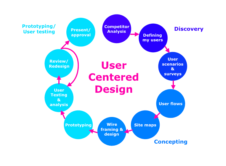
I crafted the user stories based on the goals of the app and results of user surveys and interviews.
The goals of this research are to find out:
— Habits of people who engage in water sports before going into the water.
— What information do they take into account when reading the weather forecast.
— How long does it take them to read the weather forecast.
— What information do they need in the forecast that tells them it’s safe to go in the water.
User Research & Analysis
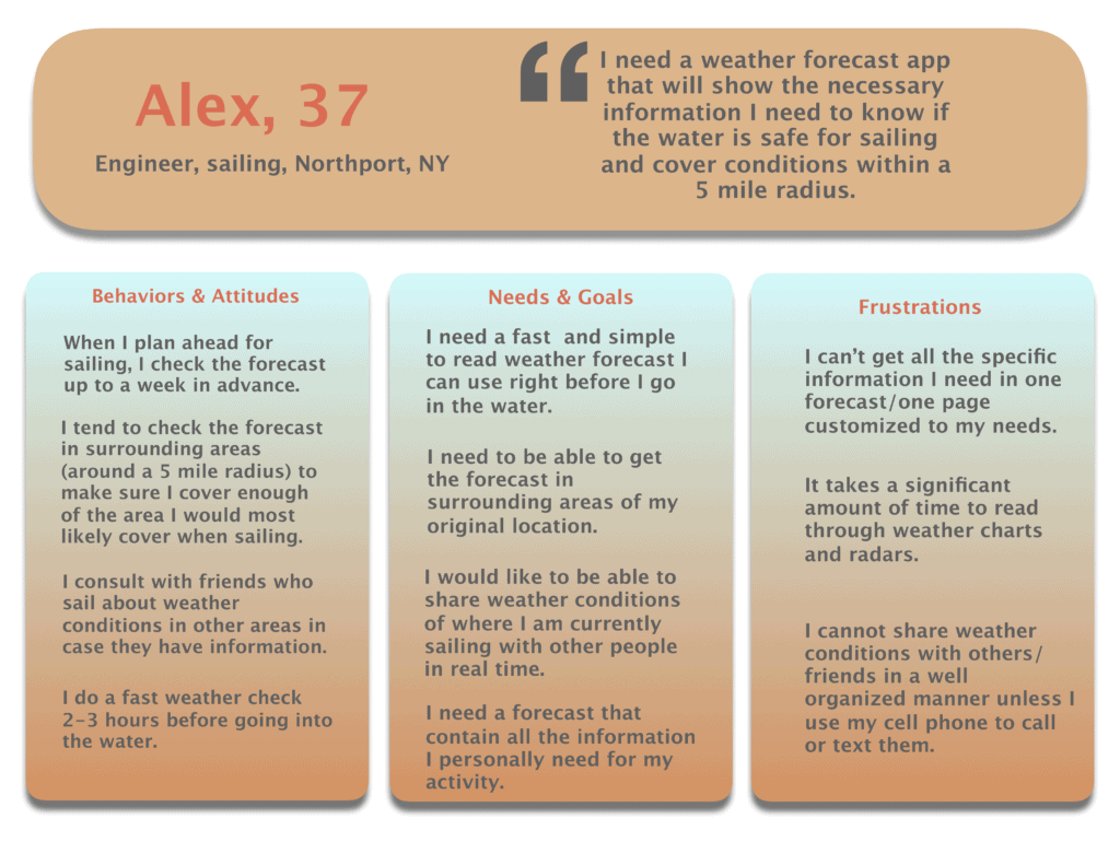
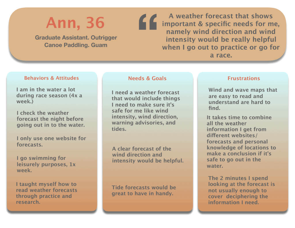
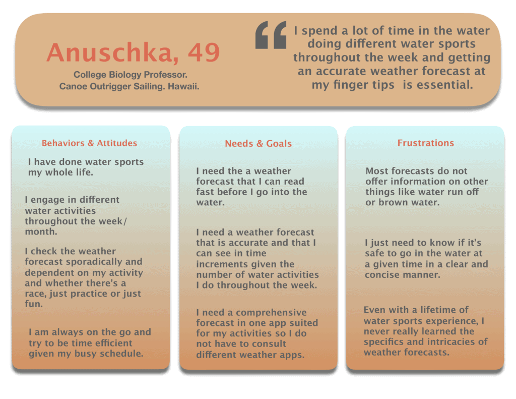
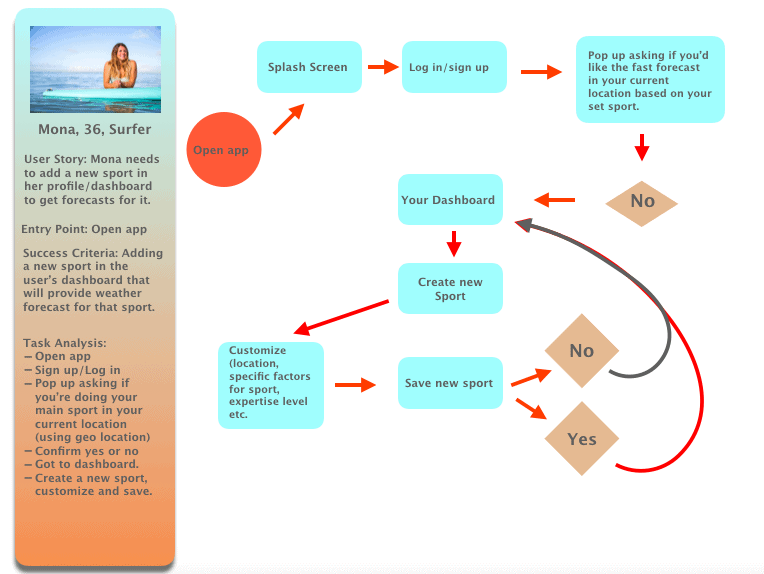
Conducting the user research and analysis gave me a window to what my user needs and wants are as well as the pain points they have with completing the tasks at hand. This led to creating the user personas along with the proper user journeys and flows needed for the app.
The Participants
4
Water sport hobbyists.

6
Water sport professionals and semi-professionals.
10
Individuals who do not participate in any water sports.
some Interview results
What my users need & want
Simple
Users need an easy to read and interpret weather forecast they can rely on to make sure it's safe to go out in the water.
customizable
The overall consensus of users was that they need to customize the forecast based on the ideal conditions for their chosen activity. Different water sports require different data and conditions.
shareable
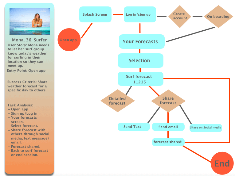
Users want a forecast they are able to share with others in an easy and efficient way. This helps to plan and organize their days with others who are involved in the same sport.
Pain points
concepting
User flows
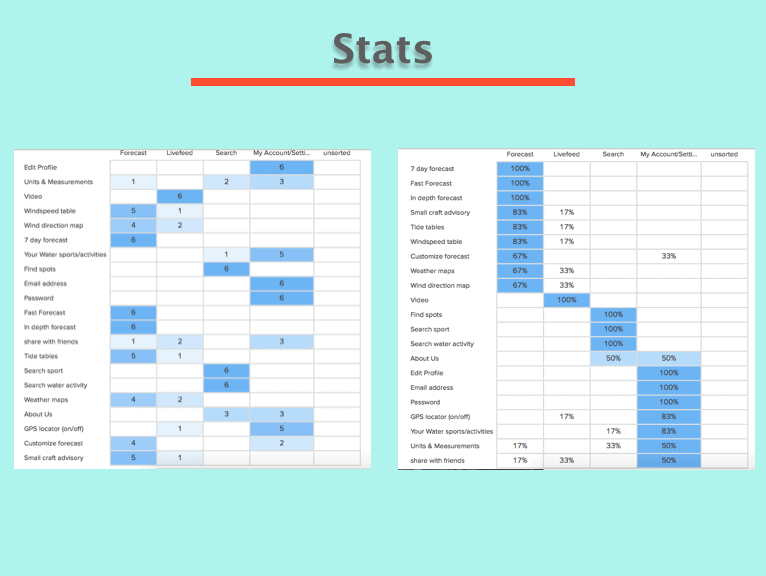
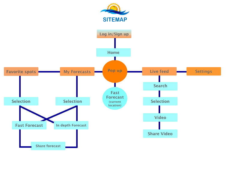
Card Sorting & Sitemap
Read the details of the card sorting and sitemap here.
Card Sorting
Sitemap
Revisiting App Goals
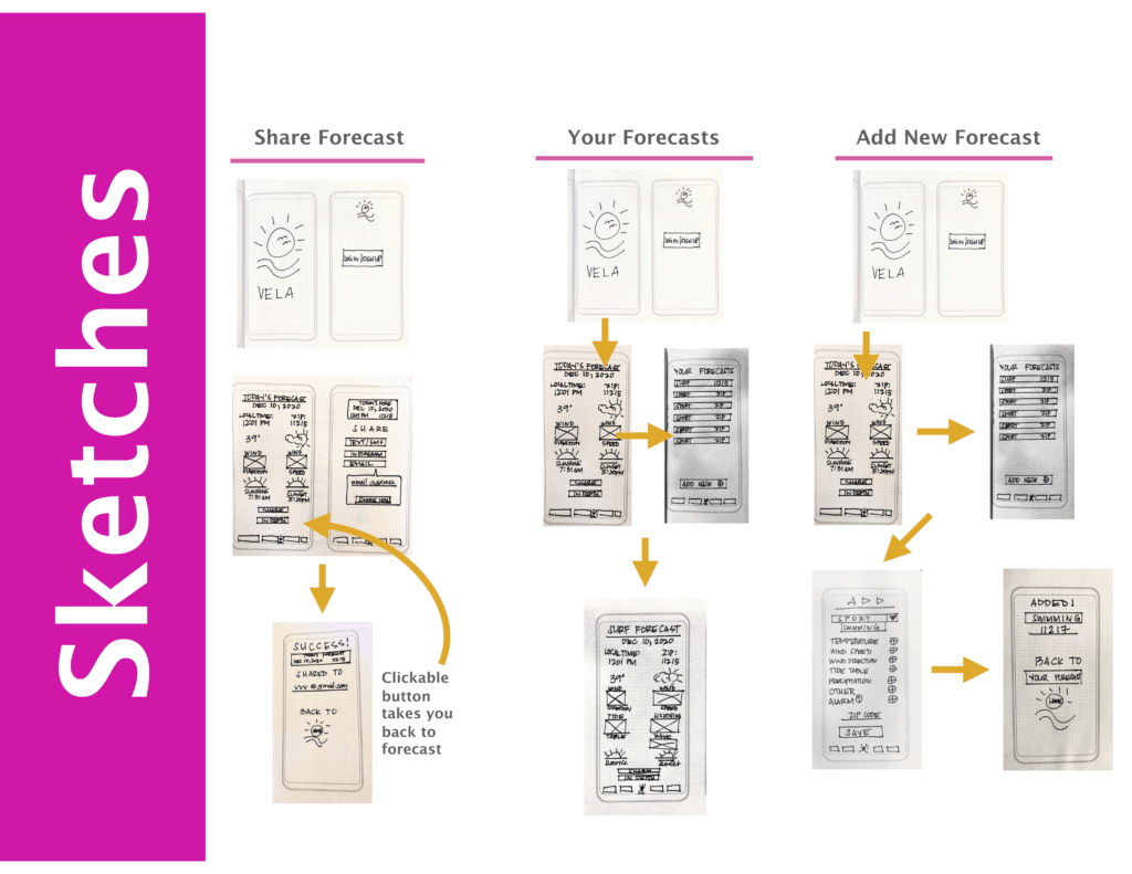
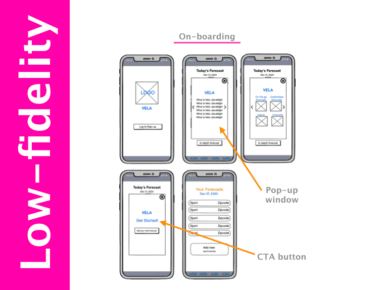
Prototyping
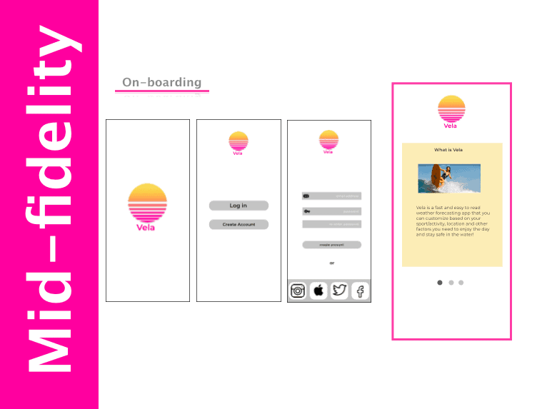
On-boarding changes:
- The pop up screen over the Today’s Forecast page was changed to a horizontal scroll in its own screen.
- After creating a new profile, it skips the homepage and takes you directly to on-boarding.
- Placed a photo in the first screen for some visual interest.
- A highlighted CTA button for better clickability.
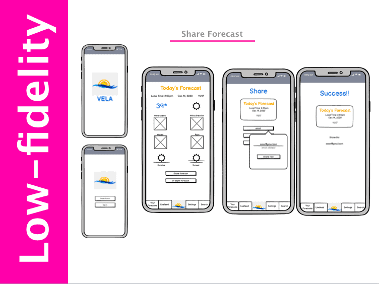
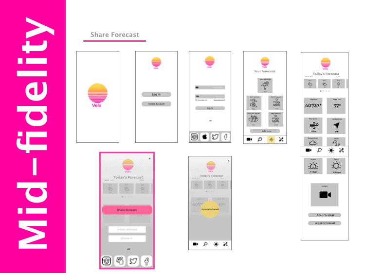
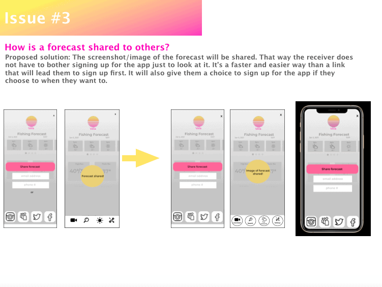
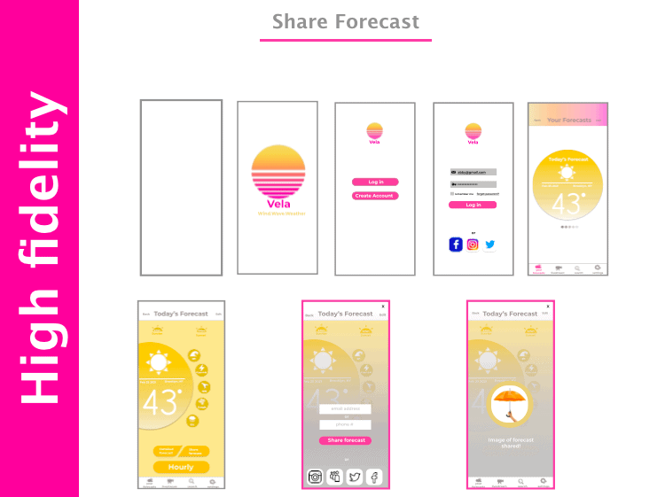
Share Forecast task changes:
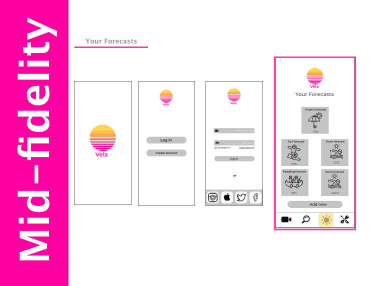
- Homescreen was changed from the splash screen to Your Forecasts page.
- Second log in page with information inputs added.
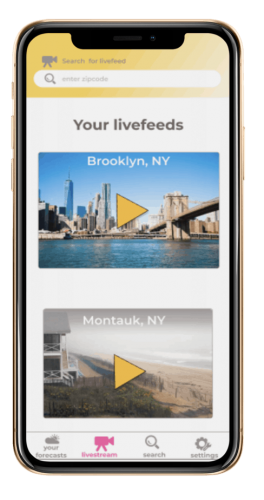
- Live stream video added to the forecast.
- Pop up window to share forecast changed to a page overlay for a cleaner, more efficient page. You can still see the forecast that you are sending.
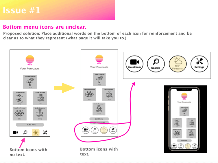
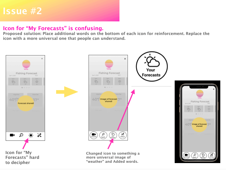
- Bottom navigation changed to floating icons for a clearer visual and added a highlight to indicate the screen you are on.
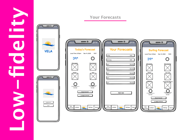
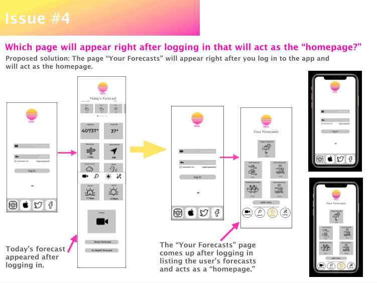
Your Forecasts task changes:
- After log in, instead of the Today’s Forecast screen, it goes straight to Your Forecasts (which is now the homepage).
- Your Forecasts buttons changed to bigger squares with icons for easy recognition and allows it to be more clickable.
- From the log in page, there are less screens to go through to see the forecasts.
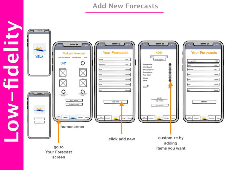
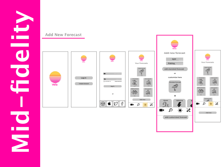
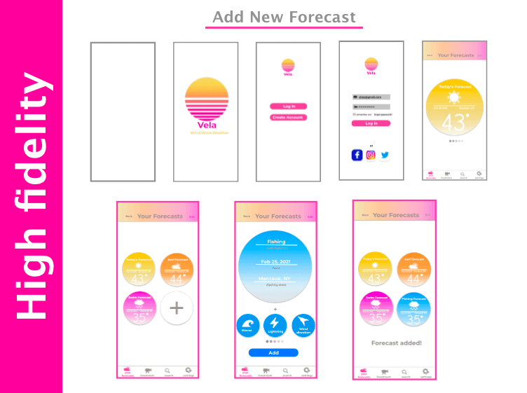
Add New Forecast task changes:
- Added proper splash page to the flow.
- Bigger and clearer input boxes.
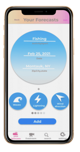
- Items to customize are in a horizontal scroll in more clickable squares for a natural hand movement.
- Friendly and recognizable weather icons on the screen.
- Displays are changed to bigger components with fun and friendly icons that are easier to read.
Logo change
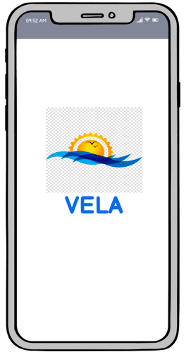
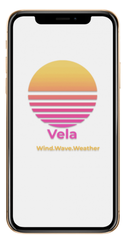
The logo was changed from the sun with waves that felt a little out of date to a cleaner, modern circle with gradient colors and a more geometric feel.
From blue and yellow to a gradient sunset of yellow, orange and pink color palette, the colors are happy and will remind you of fun in the sun.
User Testing
What users liked
“The icons are great, they are clear and informative. It’s simple and easy to read and are arranged nicely on the screens.”
-Julian/Swimming/CA
“The live feed is a great feature on the forecasts. A very helpful addition and it’s very exciting to have available.”
-Melody L./SUP/BK
“Enjoyed the way you can customize your own forecasts based on the activity you’re doing.”
-Ann G./Paddling/GU
“Loved being able to share the forecasts through social media to other people.”
-Eric C./Triathlon/CA
“The forecasts had key metrics users needed to see depending on what activity they were planning on.”
– Joe B./Water Ski/HI
“Logging in was easy and painless. No fuss and efficient.”
-Jeff B./Sailing/ NY
Addressing Issues
Perks of User Testing
Direct feedback from users both verbally and their natural interaction with the product conducted in real time.
Addresses issues and details that I may have overlooked allowing for proper and prompt corrections.
Allows me to improve my design to better fit the needs and wants of my users.
Because I'm Extra
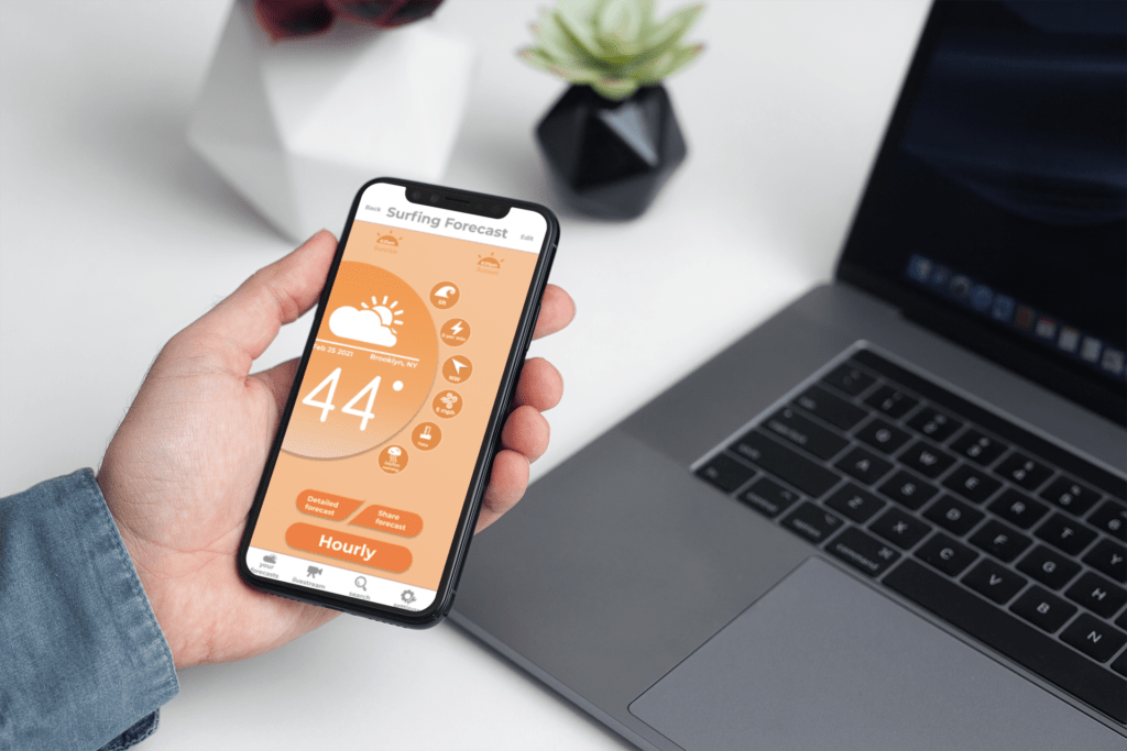
I took another step in my user testing and sent the prototype to people in the industry to get some designer based feedback. I received eye opening suggestions and was inspired to look at other weather app designs for inspiration. The result was an overhaul of my app. I made the UI modern, clean, and aesthetically beautiful. I aimed to make the UX as easy and natural as possible with as little effort on each screen to perform tasks.
Redesign
Prototyping: high fidelity
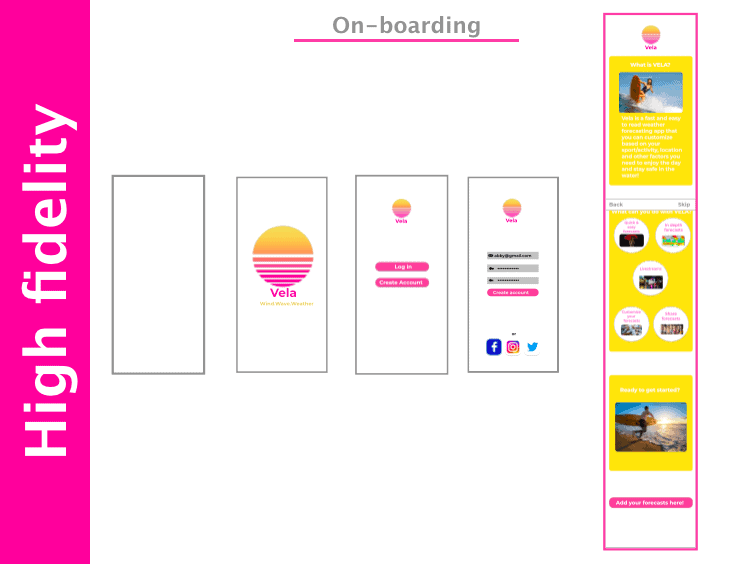
On-boarding task changes:
- Still 3 screen components but changed it to a vertical scroll which is a more natural gesture on mobile.
- Brighter yellow color for the screens that gives off a friendly welcoming vibe.
- CTA button stands out.
- Added an image in the last component screen for more visual interest.
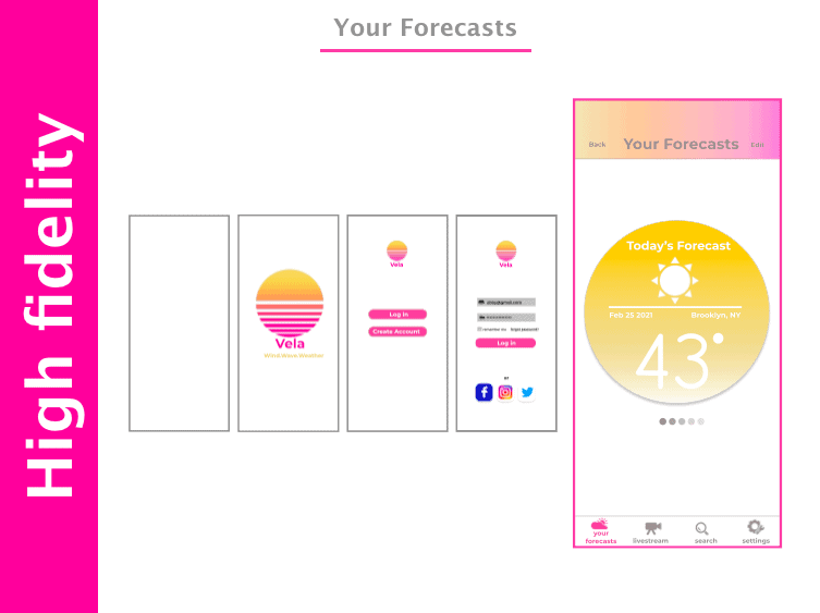
Your Forecasts task changes:
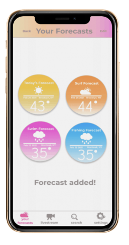
- More white space in the screen for a cleaner feel.
- Components are easy to read and look whimsical.
- Each component provides the minimum information about the weather which users need to see.
- Horizontal scroll for each forecast component provides a better organization of all information.
Share Forecast task changes:
- A more visible button for the Share Forecast feature.
- Same frost overlay on the screen to share the forecast with font on CTA button changed to white from black for consistency with the rest of the app.
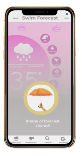
- The confirmation page shows an fun image to act as a reward for sharing to people, spreading word about the app to others.
- The confirmation page copy clearly tells users what is being shared(an image of the forecast).
Add New Forecast task changes:
- Click on edit on the top nav of the Your Forecasts page to add a new one.
- The page shows you all the forecast components plus an empty one with the + sign to urge and indicate to add there. It allows for a nicer flow and consistency in the screen.
- Horizontal scroll for customizing the forecast have clear icons and short, precise copy.
- Confirmation page shows completed component added with the others for a satisfying feel to the screen.
Check Out the Vela app here!
Insights
- It’s challenging to fit a lot of information in one screen but there are creative ways to convey them efficiently & aesthetically.
- Getting user feedback (user testing and research)as well as feedback from other designers is the most valuable tool in my design process.
- Design is a continuous process and I have to be open and adaptable to keep improving my products.

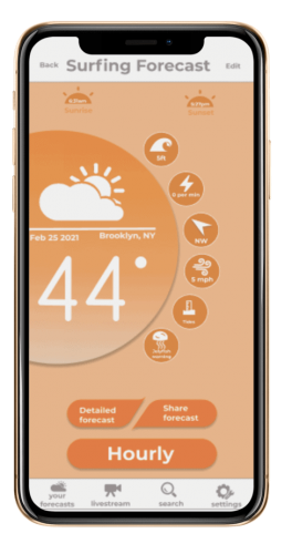
Watch how Vela works!
Enjoy a short demo of the Vela app and explore some of its key features here.
Did you like Vela?
See what The Abby Experience can do for your projects. I’m here to help!
