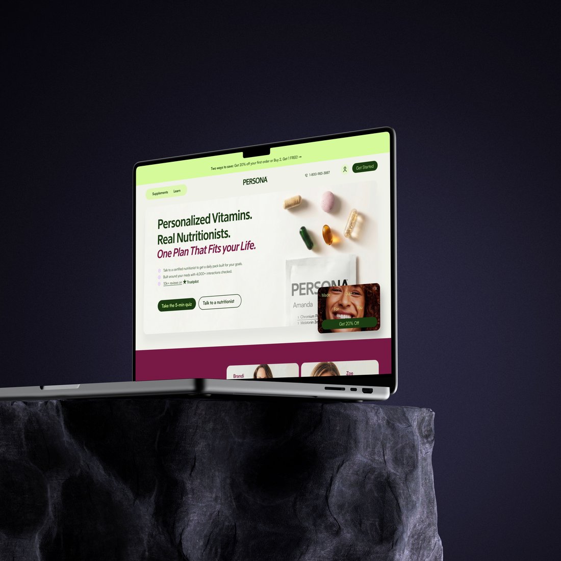
Optimizing Persona Nutrition's checkout to cut friction and cart abandonment, turning more visitors into confident, completed orders across desktop and mobile.
Checkout is the final, highest-stakes step in the funnel, and the place where hard-won interest is most easily lost. Even small friction points, extra fields, unclear pricing, weak reassurance, or a clumsy mobile layout, quietly cost completed orders.
I audited Persona's existing checkout, mapped where shoppers hesitated and dropped off, and redesigned the flow to be faster, clearer, and more reassuring. The goal was to remove every unnecessary obstacle between decision and purchase while reinforcing the personalization and trust that brought shoppers this far, so more people finish with confidence.
This was not a one-and-done redesign. It evolved over several years through many iterations, testing different layouts, copy, and step orders against real behavior to see what actually moved the needle, then refining the flow again and again based on what the data and users told us.
A data-informed approach that removed obstacles at every step while keeping trust and personalization front and center.
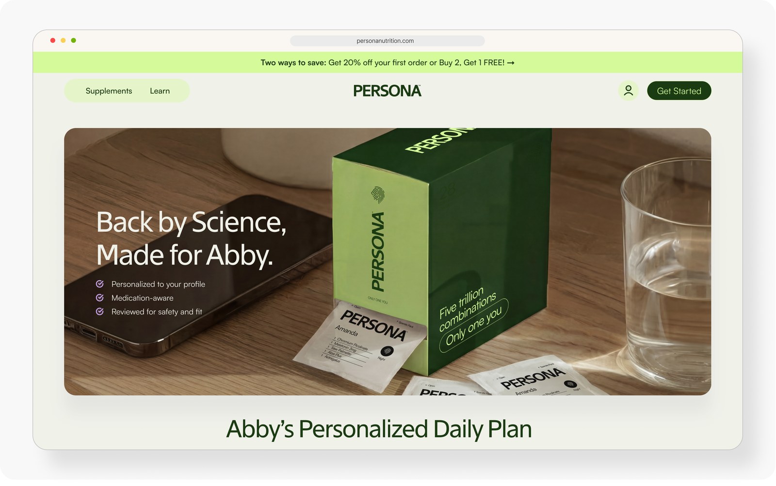
The whole flow leads to one moment: a confident purchase and a plan made just for you. Every checkout decision worked back from that payoff, cutting friction while keeping the personalization and reassurance that make finishing feel worth it.
The moment the personalized plan is revealed. From a plain list of products into a clear, persuasive recommendation that shows why each pick fits. Hover any version to scroll its full page.
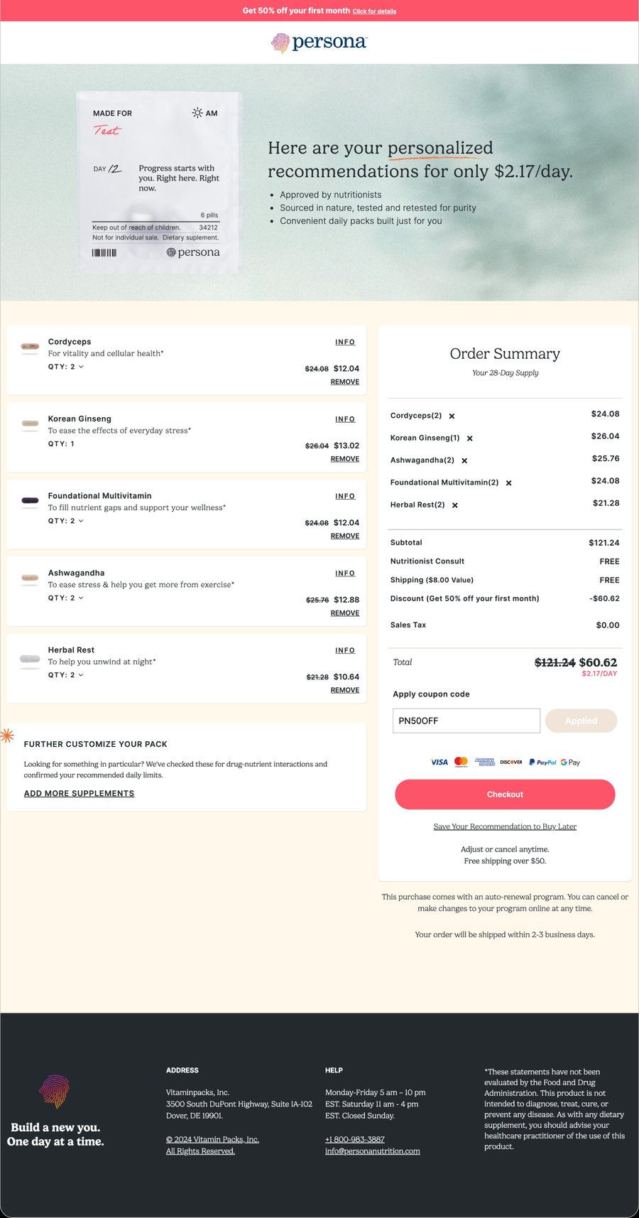
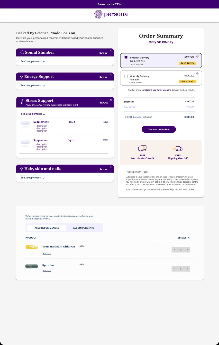
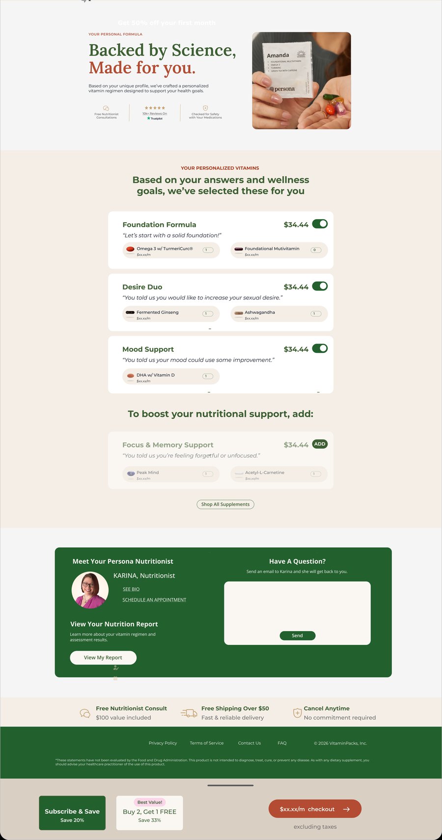
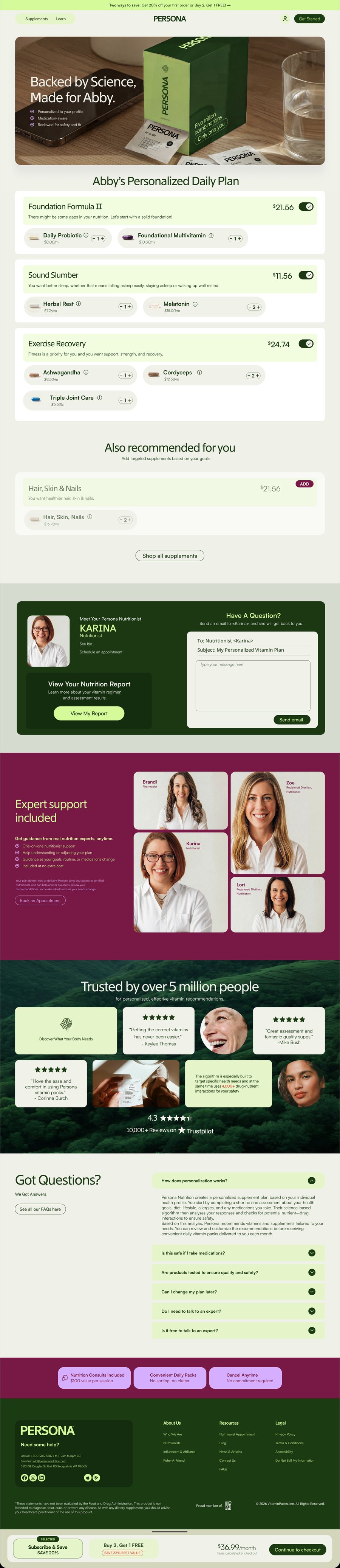
This is where the personalized plan is revealed and the shopper decides whether to buy. It has to make each recommendation clear and trustworthy, so the value is obvious and moving to checkout feels like the easy, natural next step.
Present each recommendation clearly, with the reasoning behind it, so shoppers understand what they're getting and feel confident enough to check out.
Switch views, then hover a label to see what changed.


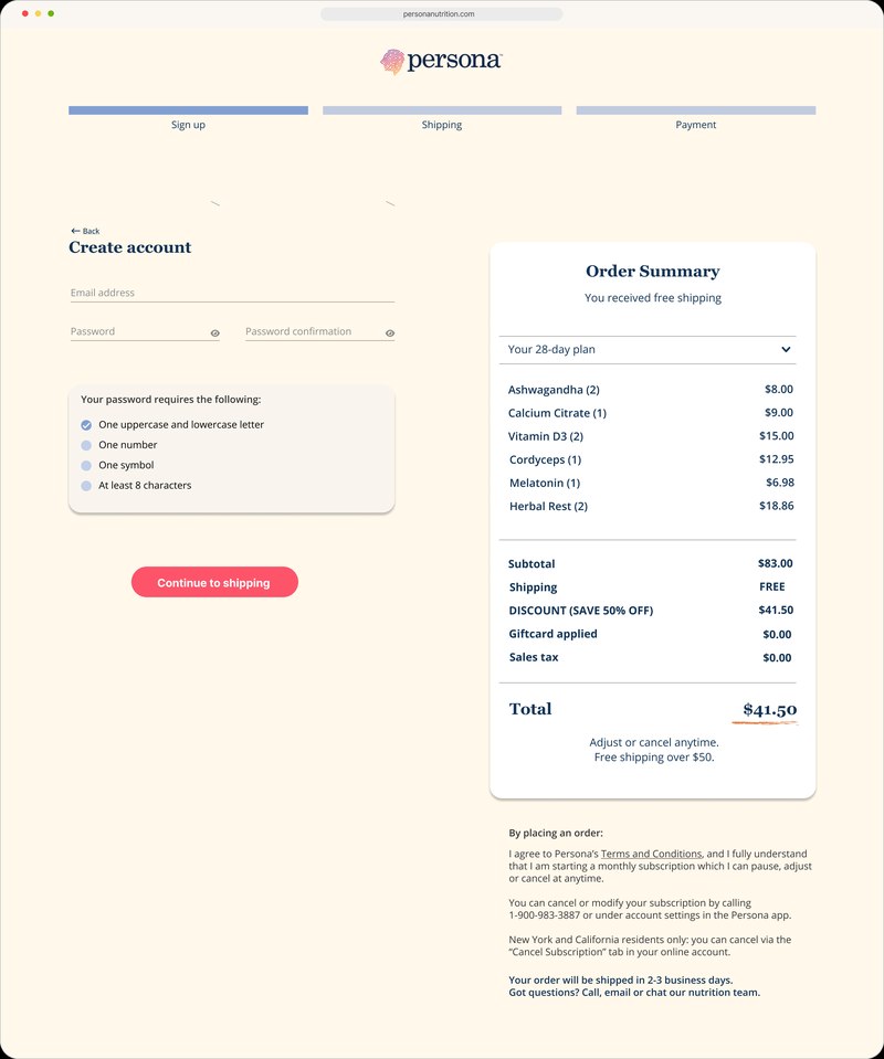
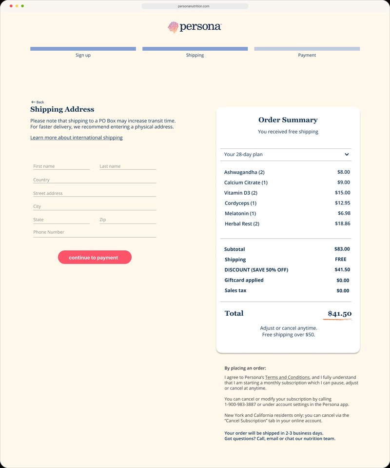
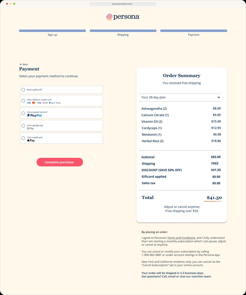
The checkout page is the final step, where any leftover friction or doubt quietly costs the sale. It has to feel fast, clear, and reassuring: collecting only what's needed and making it obvious how to finish.
Move shoppers from cart to confirmation with as little friction as possible, keeping the form short, the costs clear, and trust high all the way to the button.
Switch views, then hover a label to see what changed.