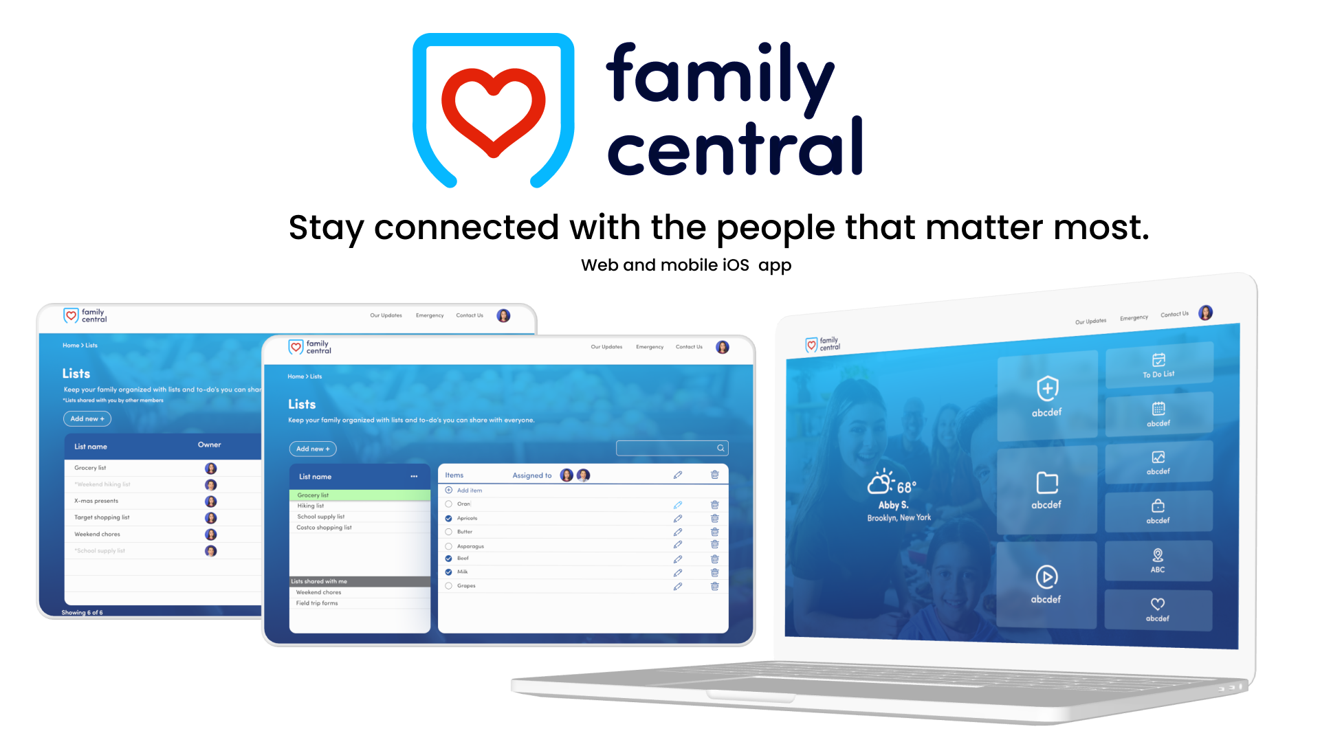
Share vital information securely. Family Central is a personalized Web and Mobile App that reduces chaos and stress in daily life. Prepare for life’s inevitable emergencies by removing confusion and anxiety during a critical time.

Role
Jr UX/UI Designer

Duration
3 months

Tools
Figma, Zeplin, Asana

Product
Web Application
Project Brief
Redesign the Family Central web app 'List' feature applying the current design system in place and ensuring UI and branding consistency across the platform.
Create
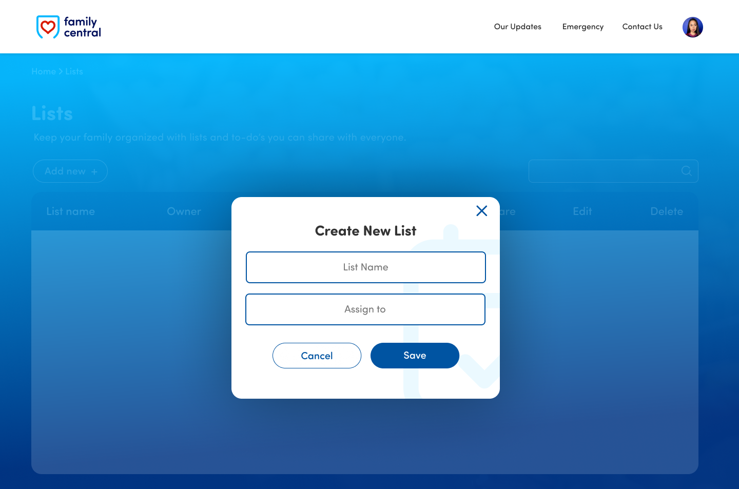
Be able to create new lists of things and to-do's in an efficient and manageable way.
Add/delete
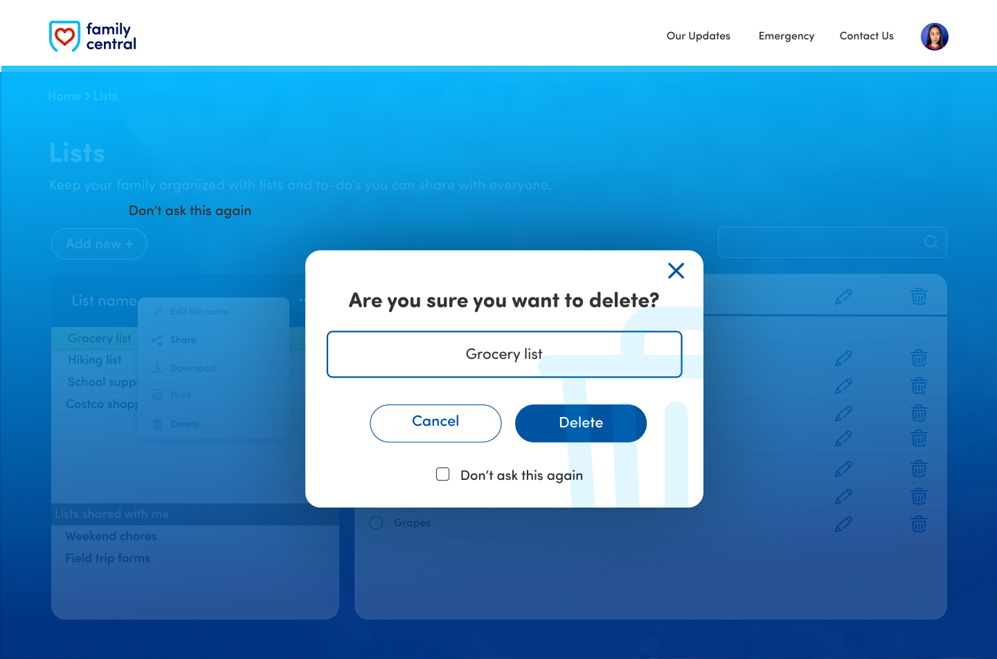
Be able to add a new list or new items on an existing list and easily delete items on a list or completely delete existing lists.
Share
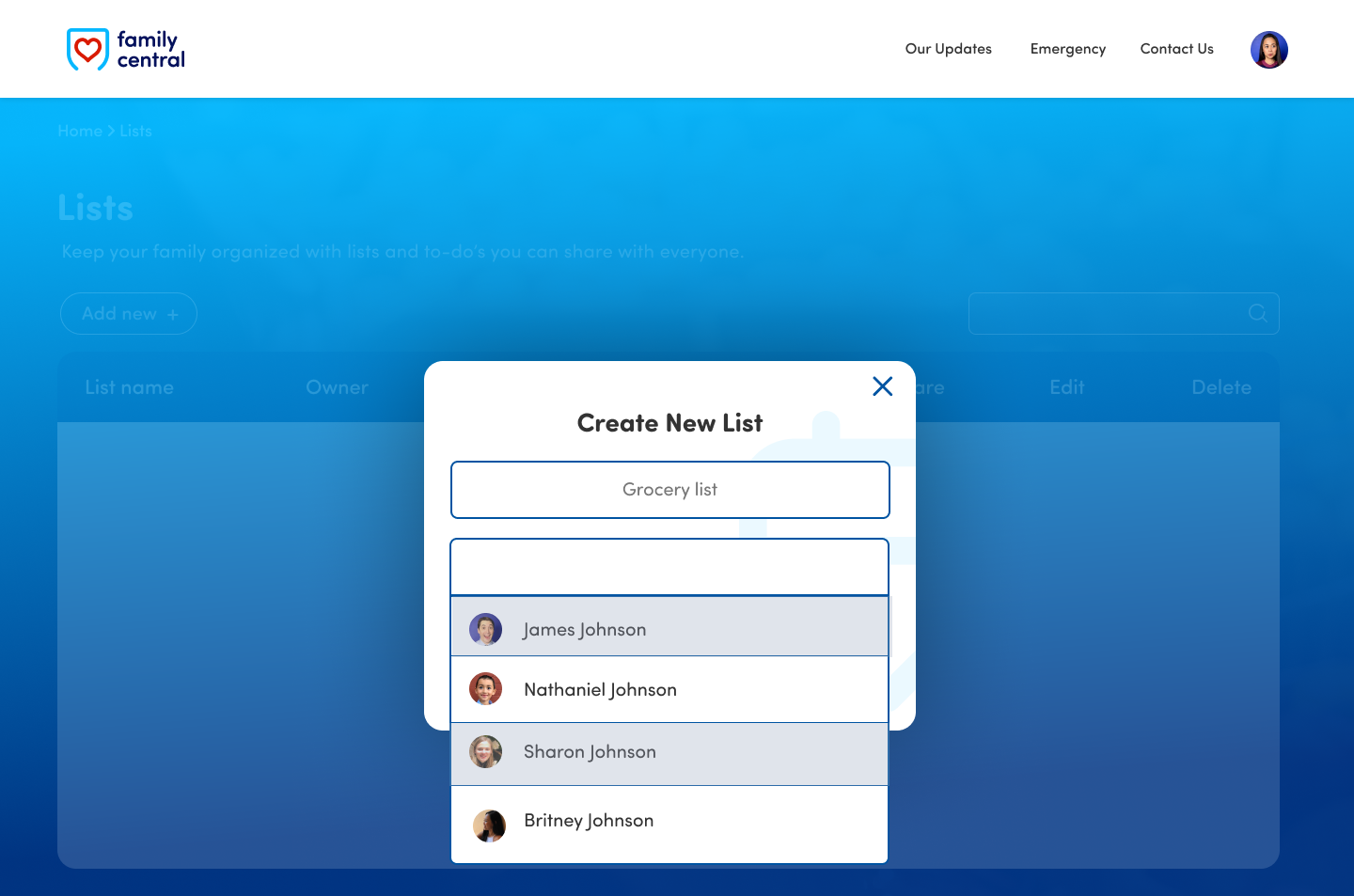
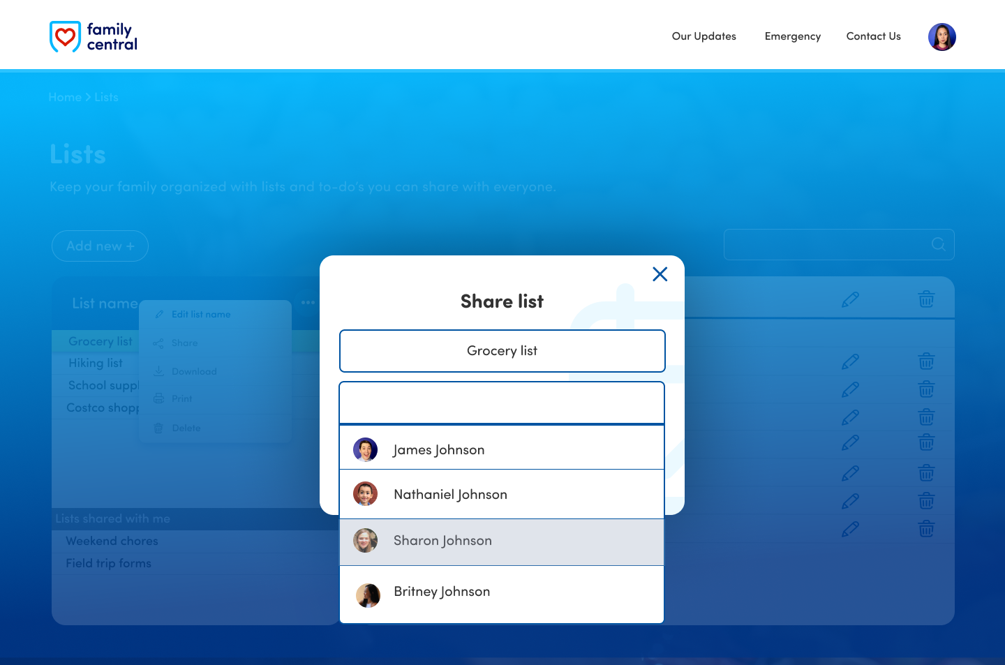
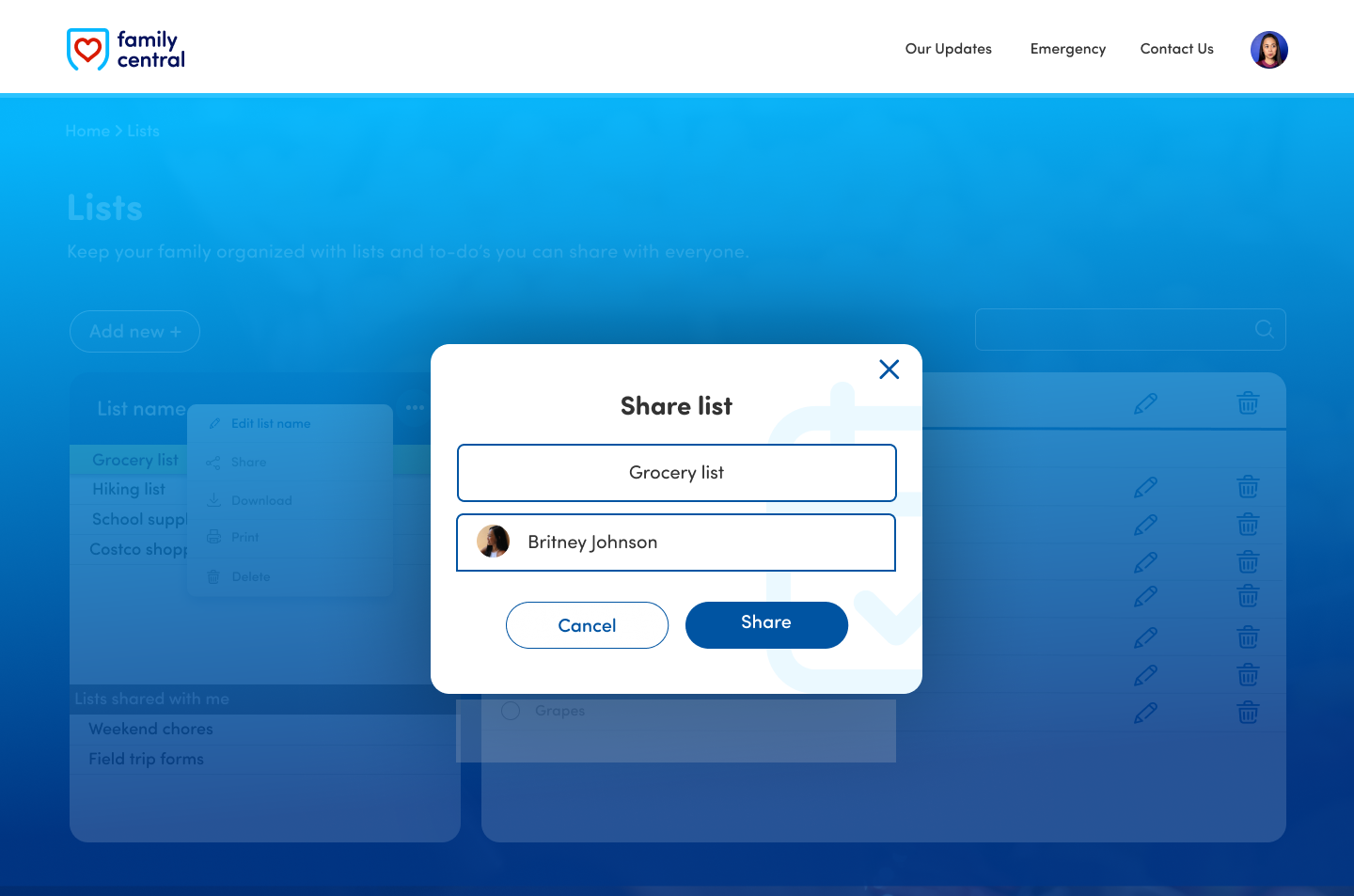
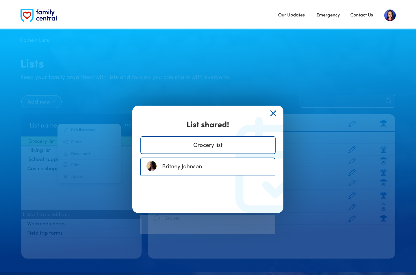
Be able to share lists with members of your family to coordinate tasks better.


Research and Analysis
What apps do people use for making lists?
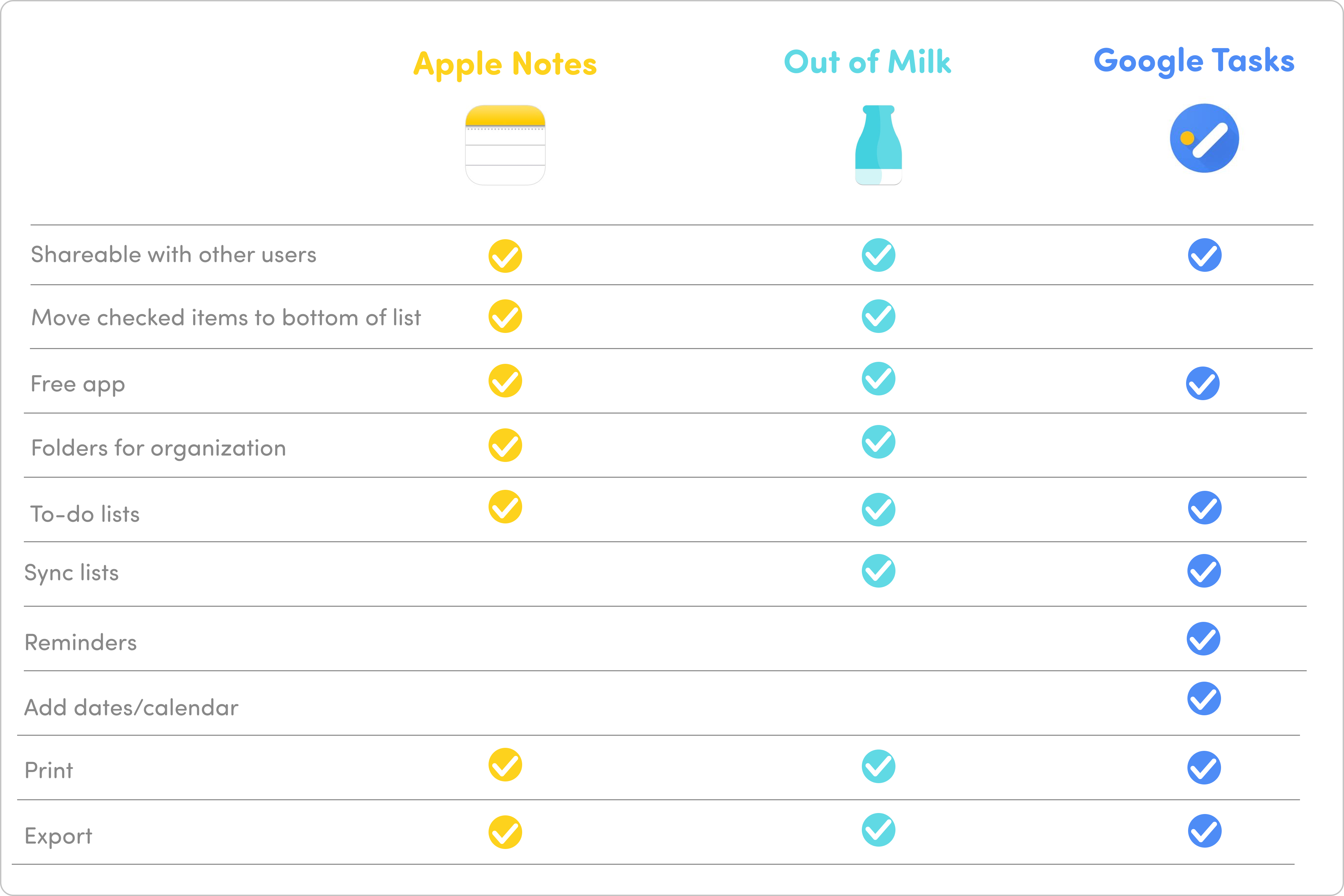
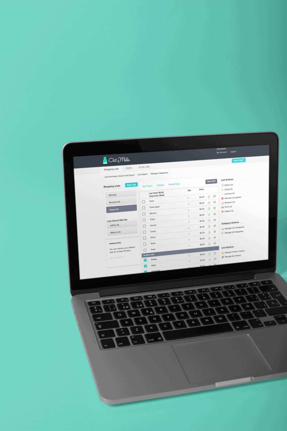
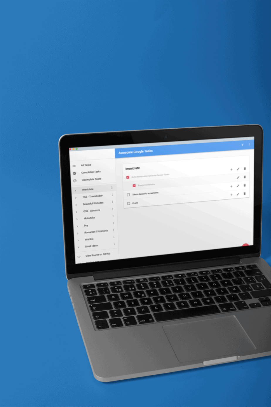
Here are three common to-do list apps used by users.
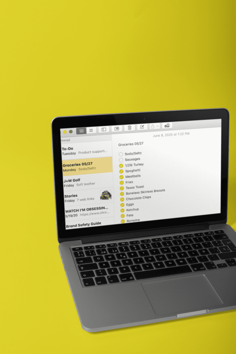
Apple Notes
Out of Milk
Google Tasks
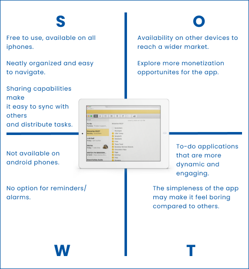
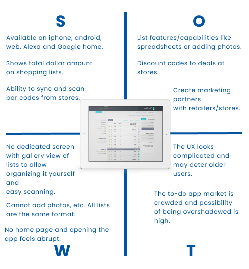
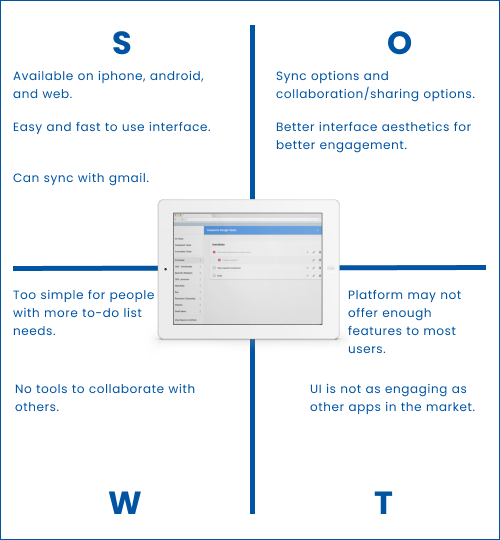
SWOT Analysis
User Interviews
Who are the interviewees?
Age group
M/W 20-30 yrs old, M/W 30-40 yrs old, M/W 50-65 yrs old.
# of people
15
Family role
6 Head of household, 4 extended family, 5 offsprings.
Take-aways
Simple
Users want an easy-to-use and reliable list app for their everyday tasks.
Shareable
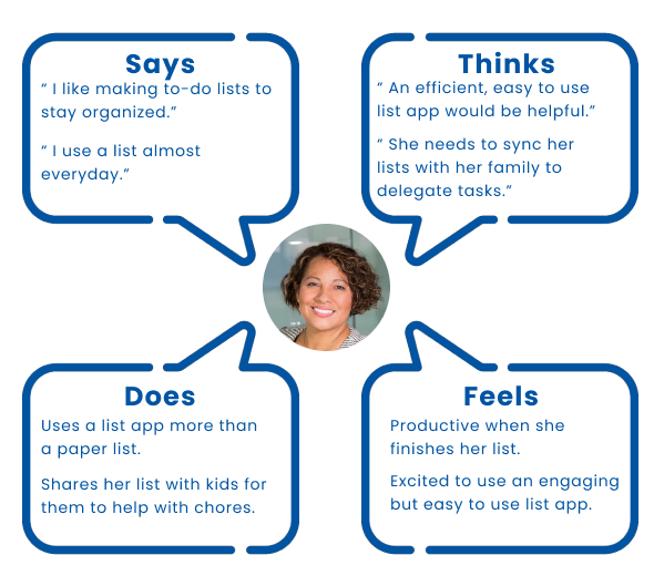
Users want the option to sync and share their to-do lists with others especially family members to help with tasks.
Stimulating
Users are most likely to stick with their lists if they have an app that was engaging to use.
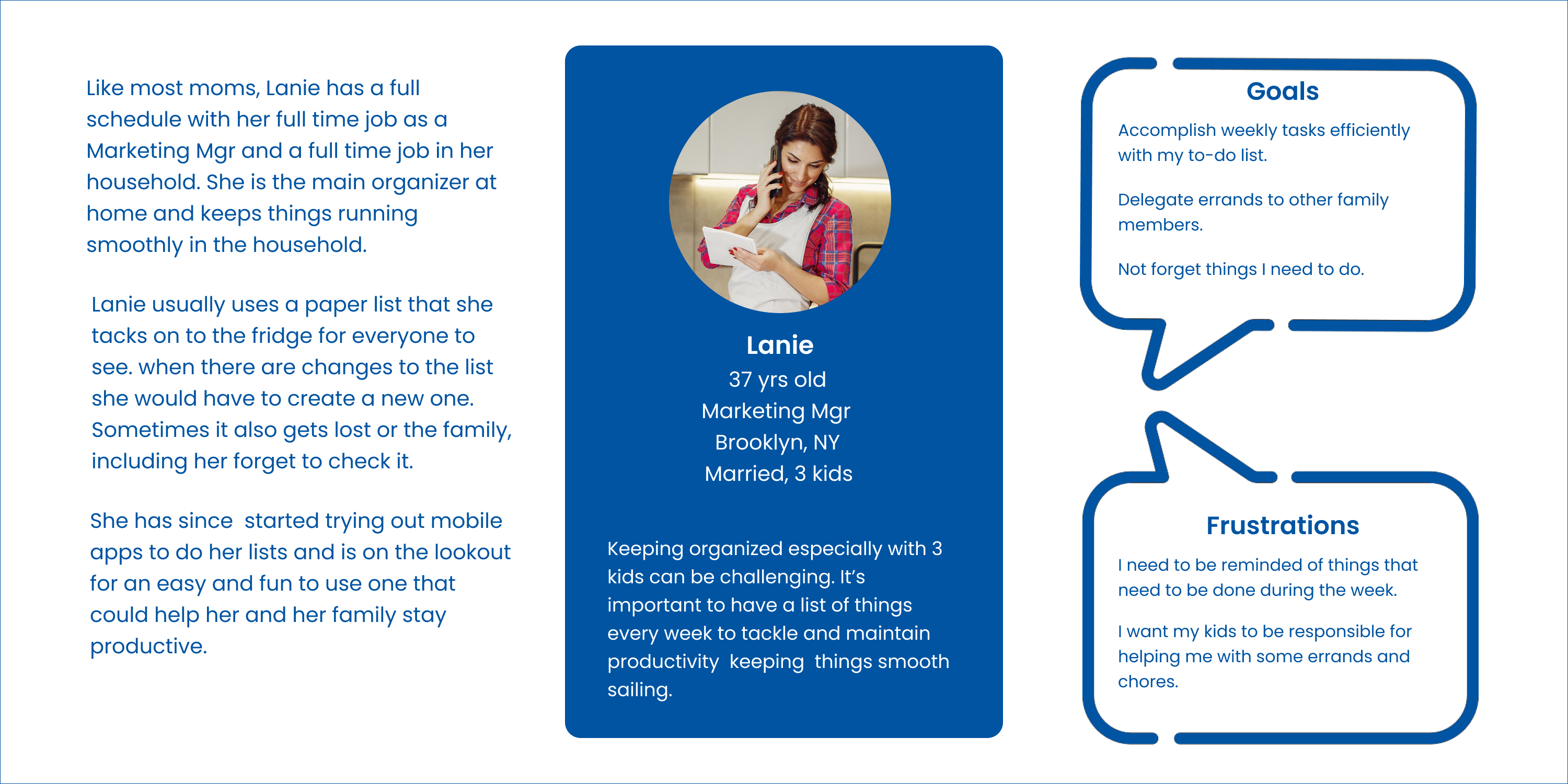
User Personas

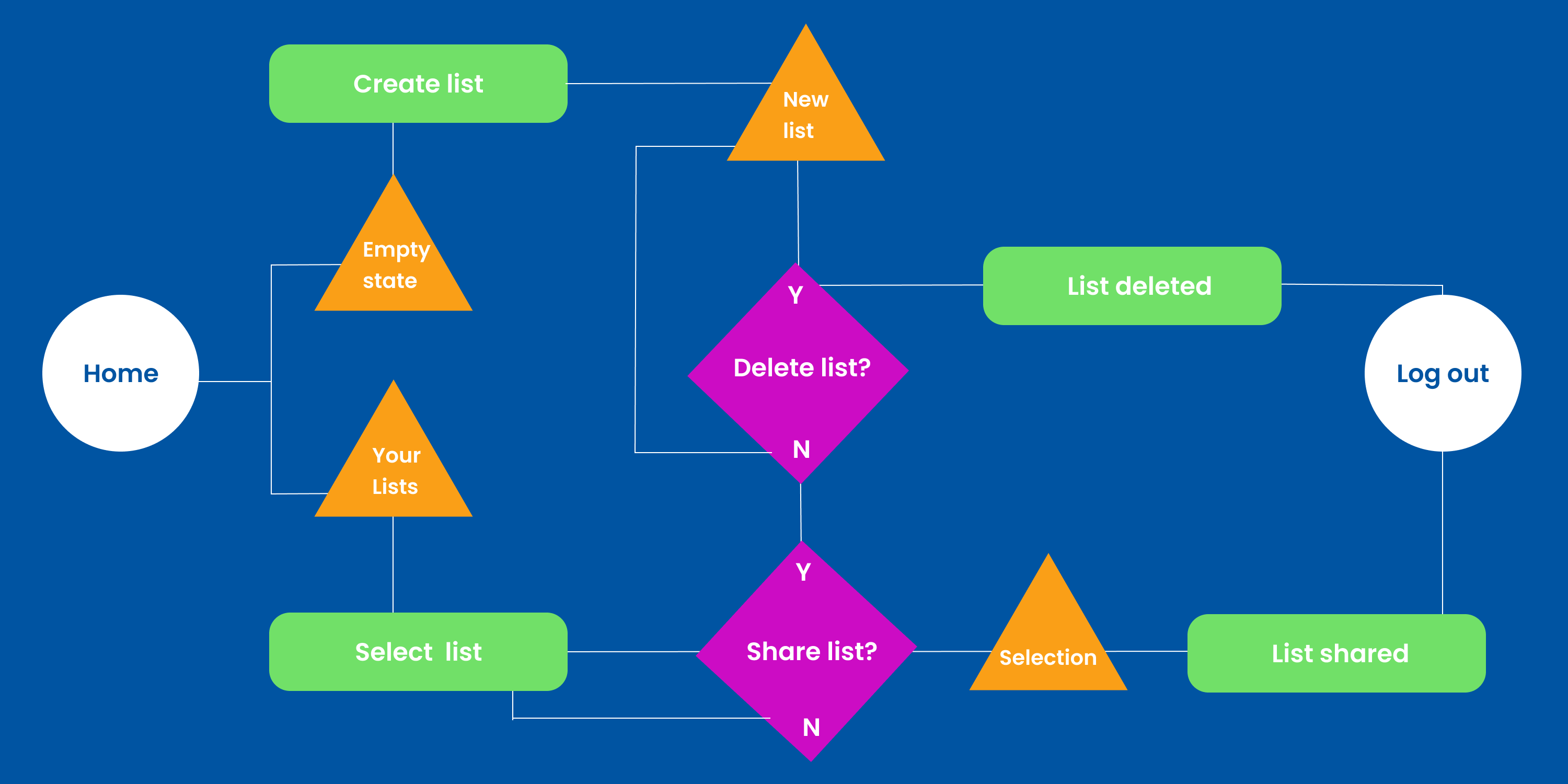
User Flow Map
Redesign: 1st Iteration
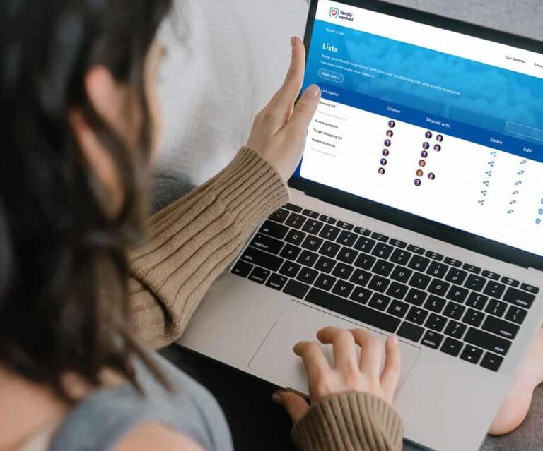
Per the guideline of the creative director and development team, the first iteration of the “List” feature should be as close to the old design as possible and incorporate the following 3 tasks:
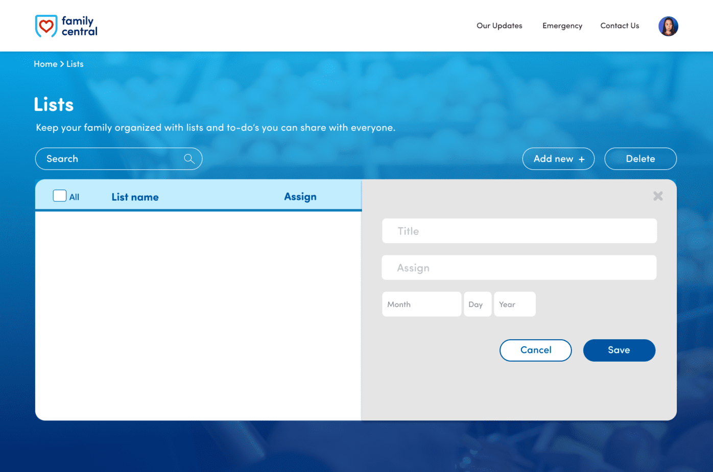
- Add/create new list
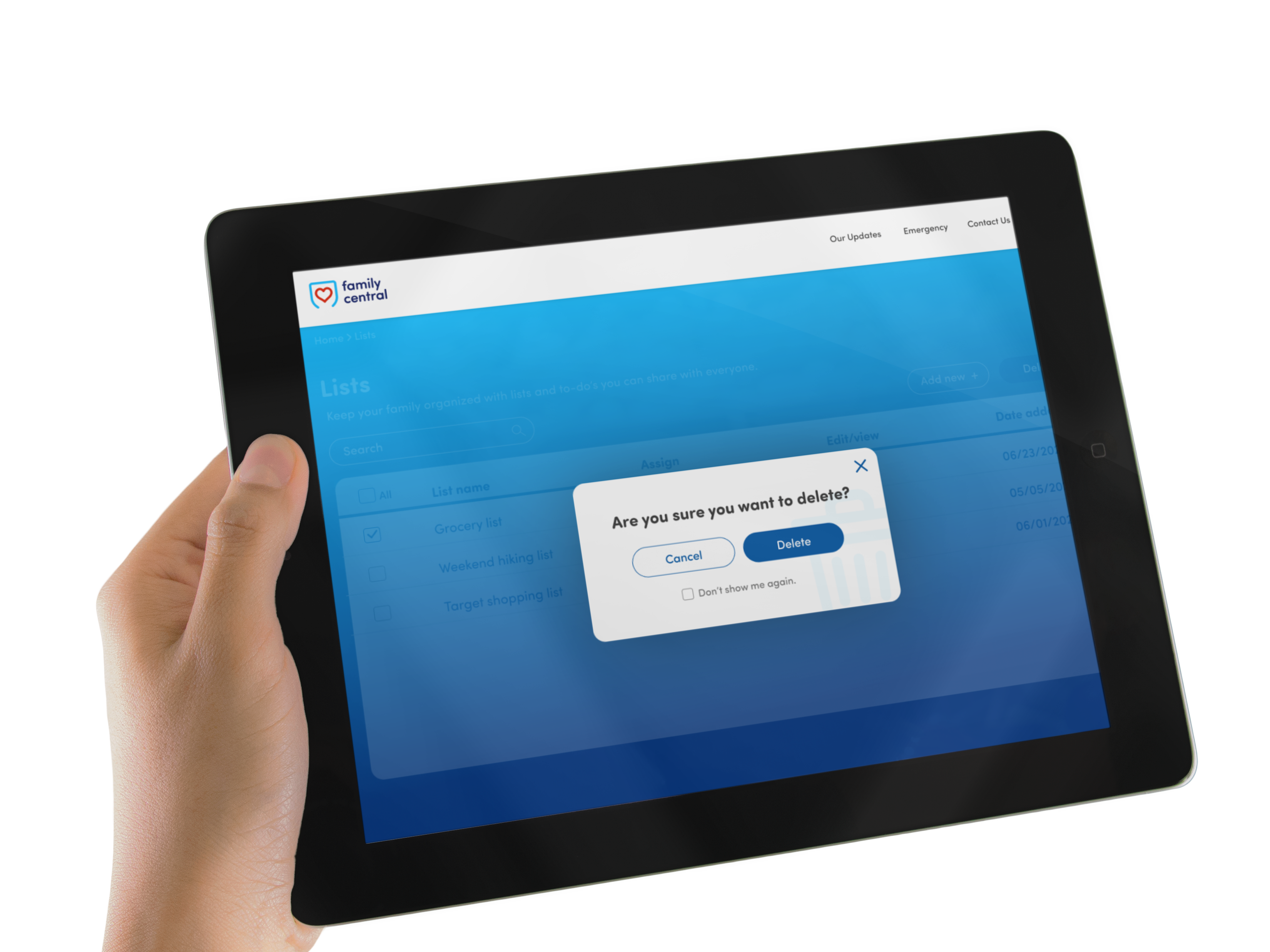
- Delete list
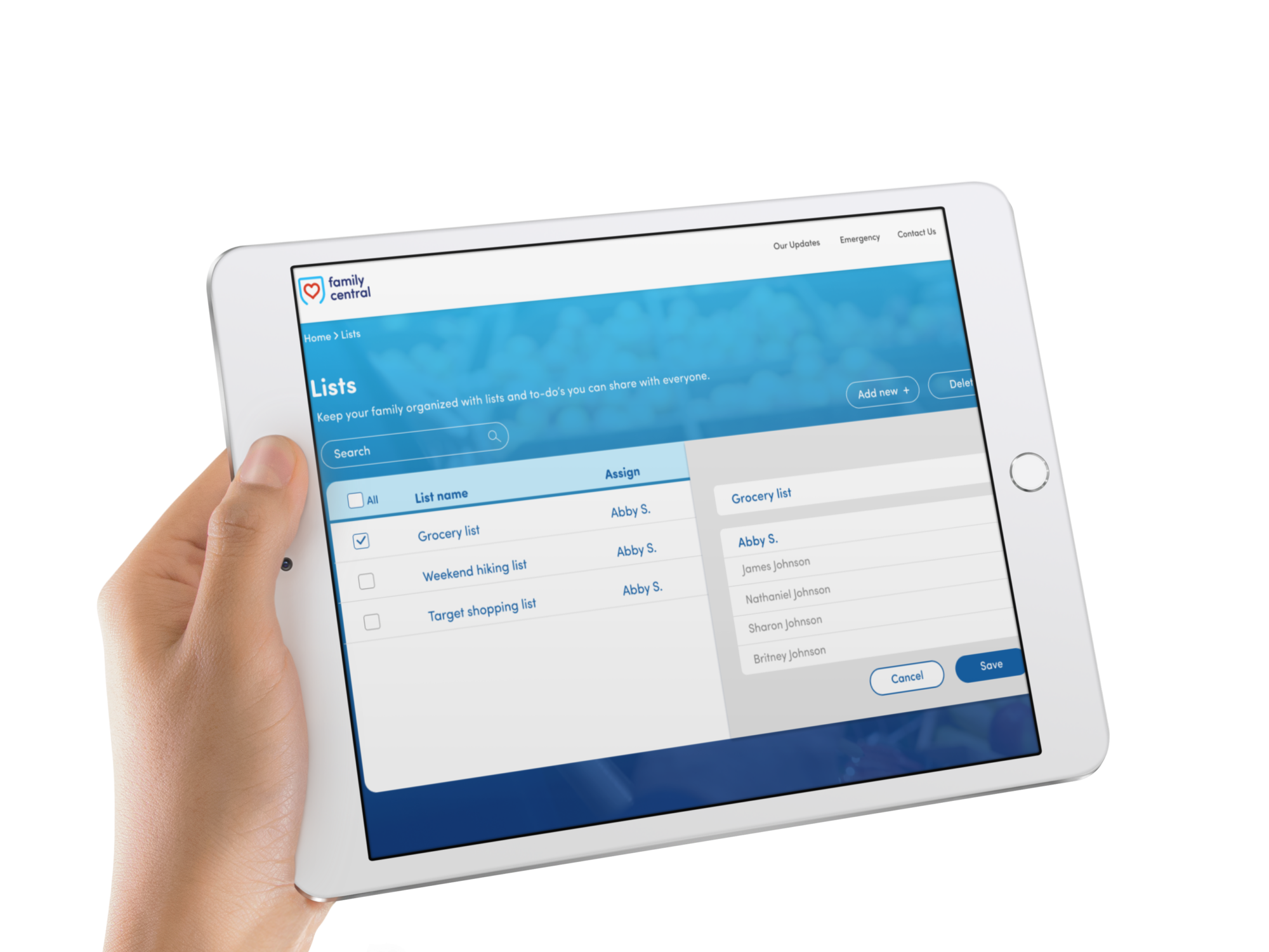
- Share list
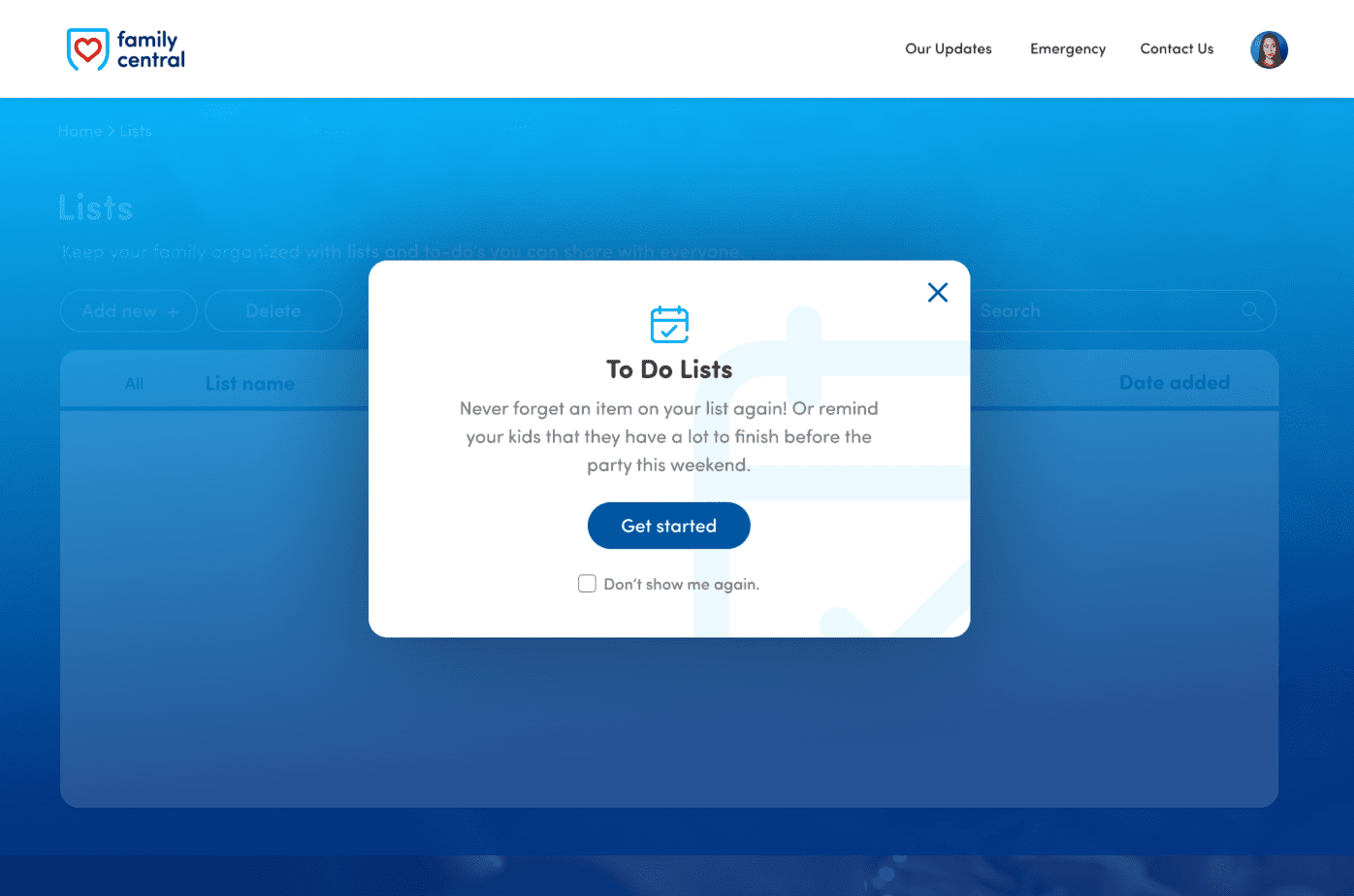
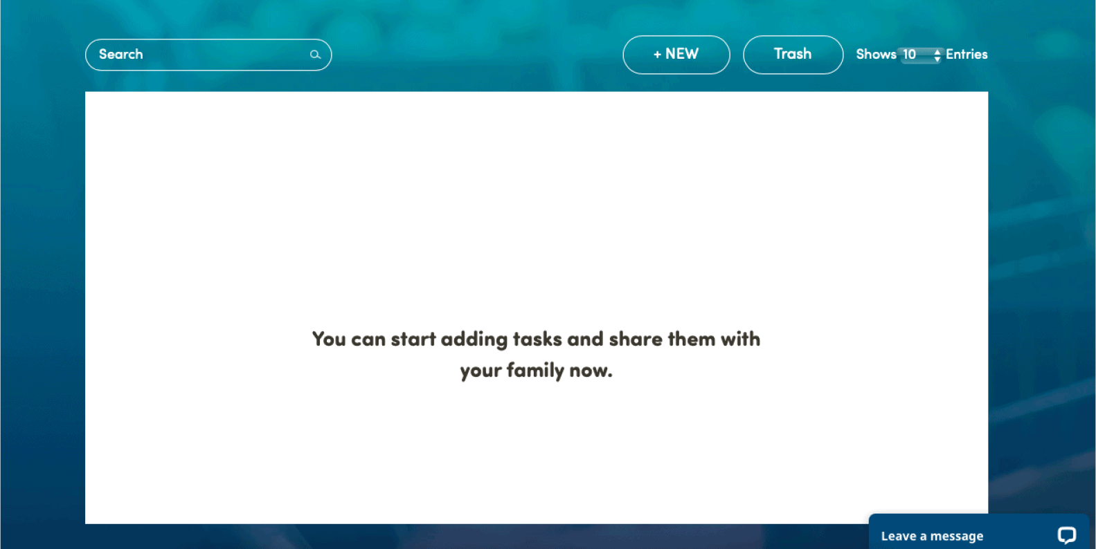
Empty State
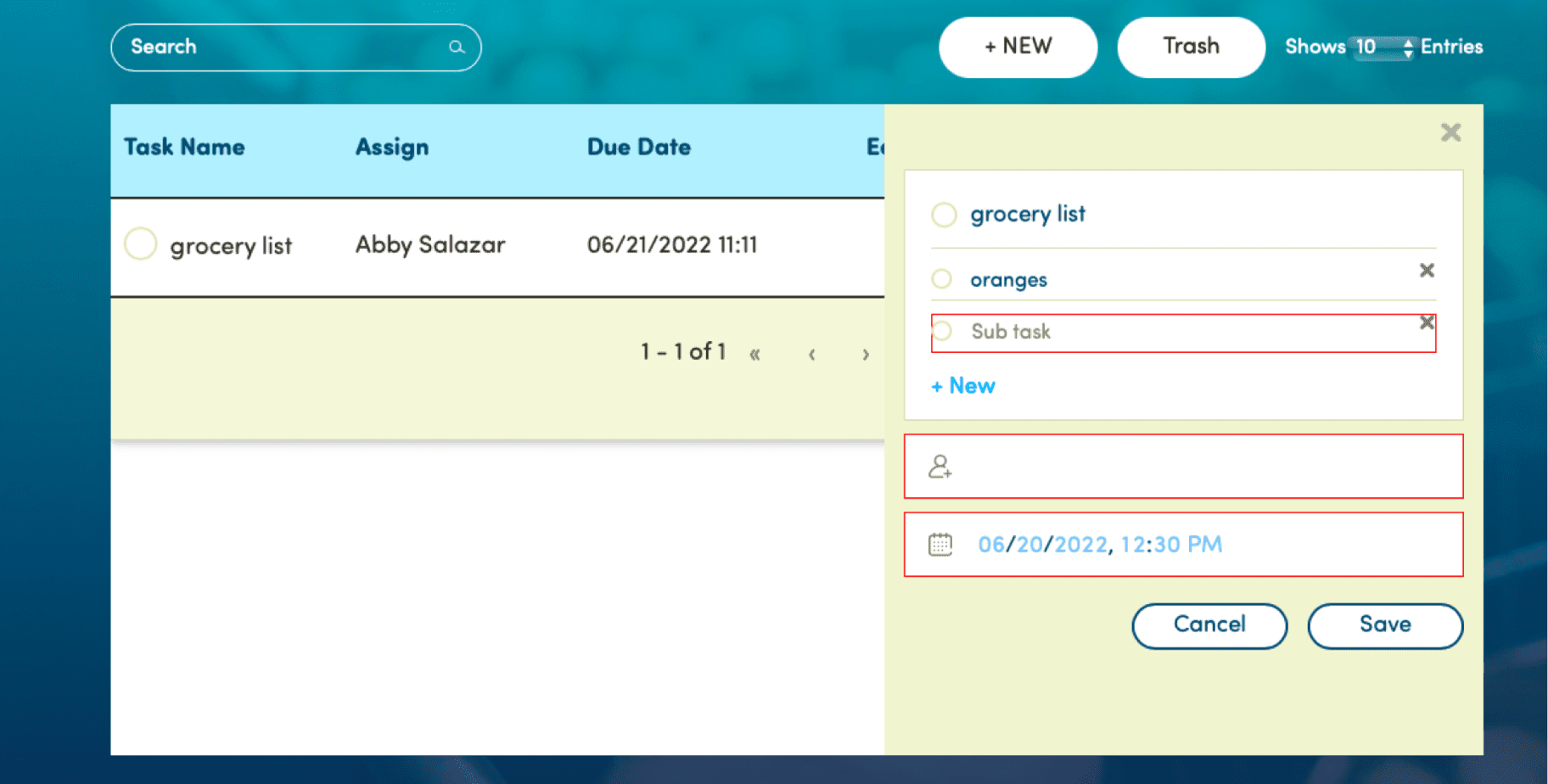
List
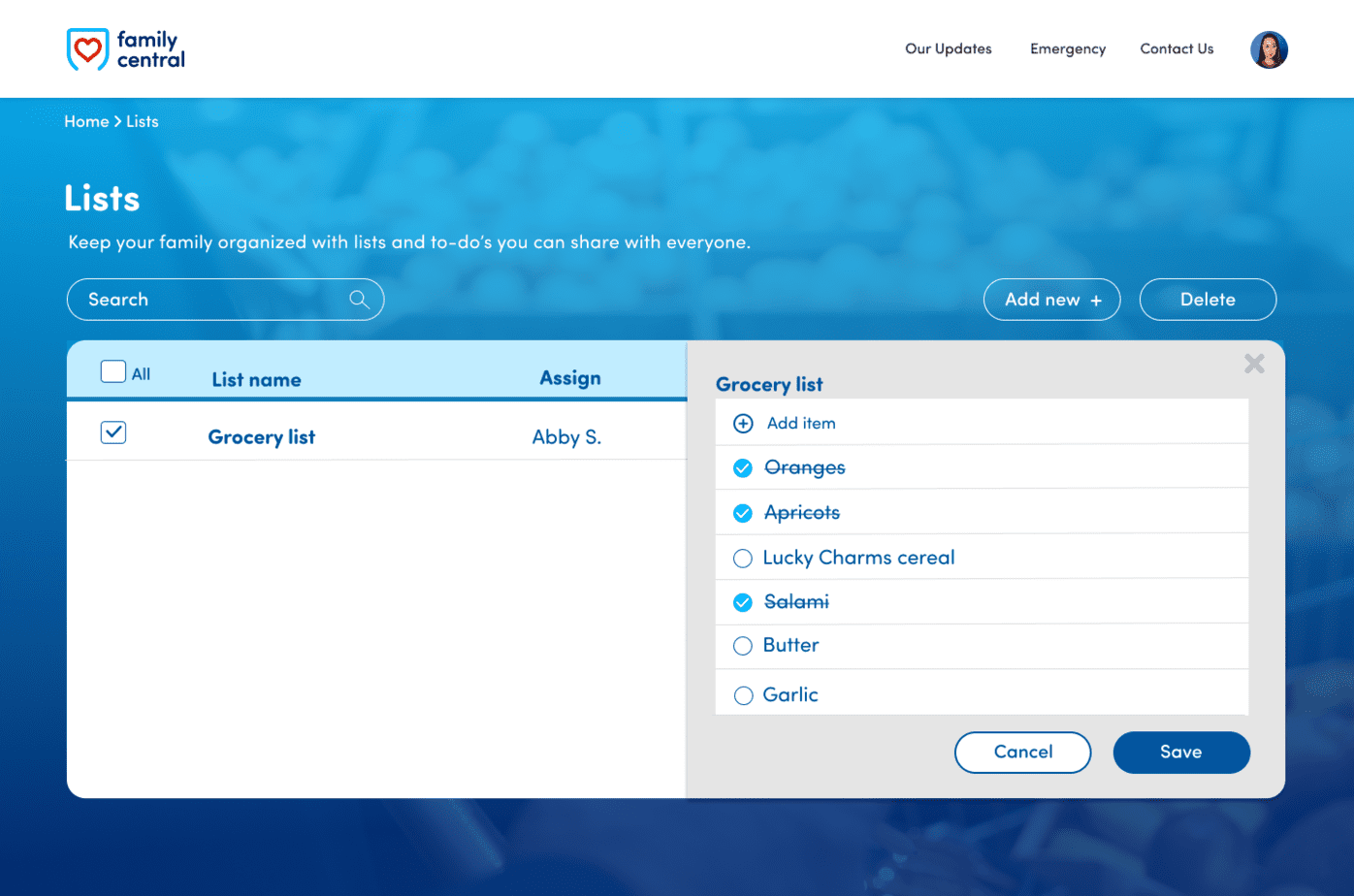
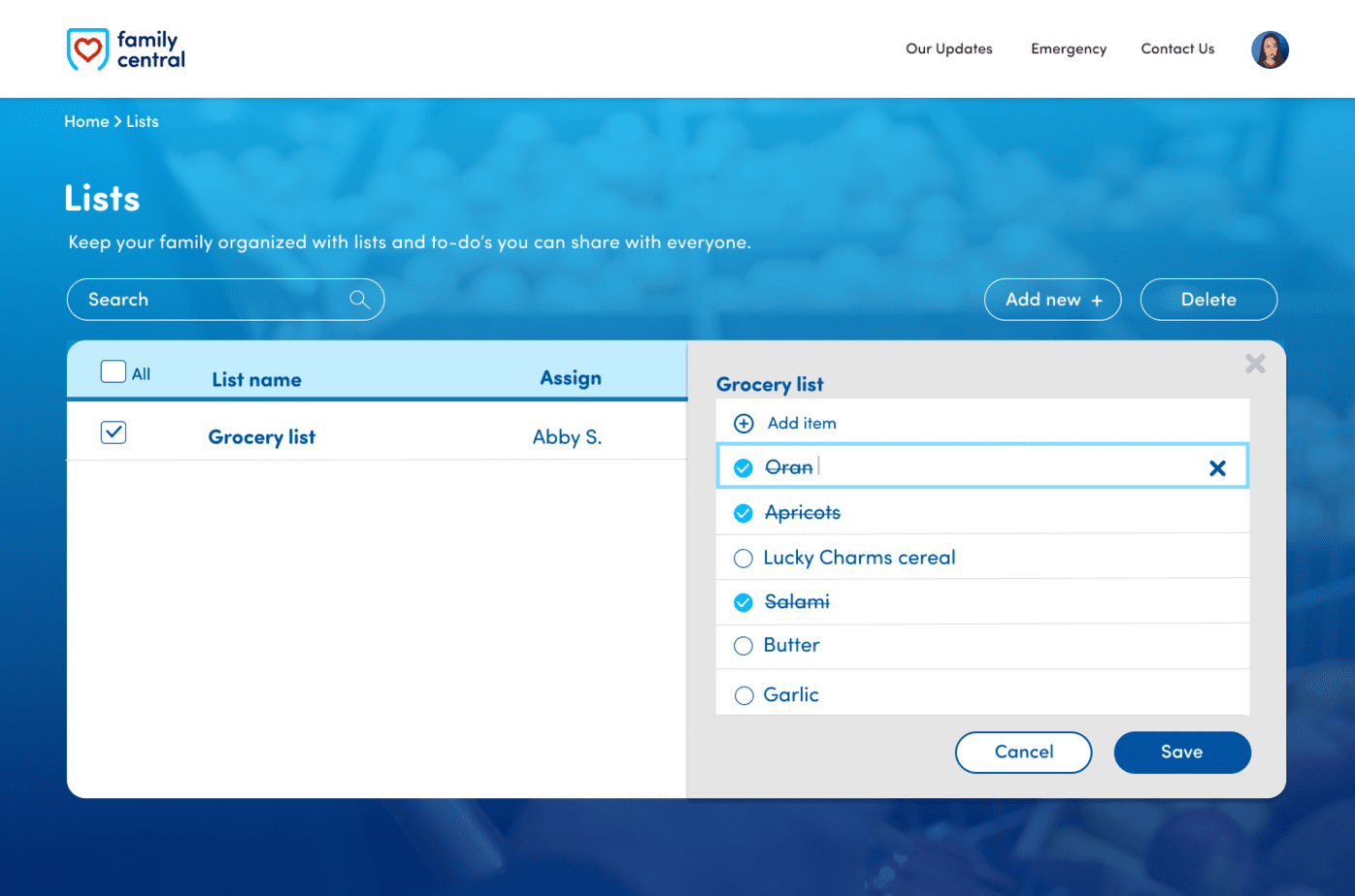
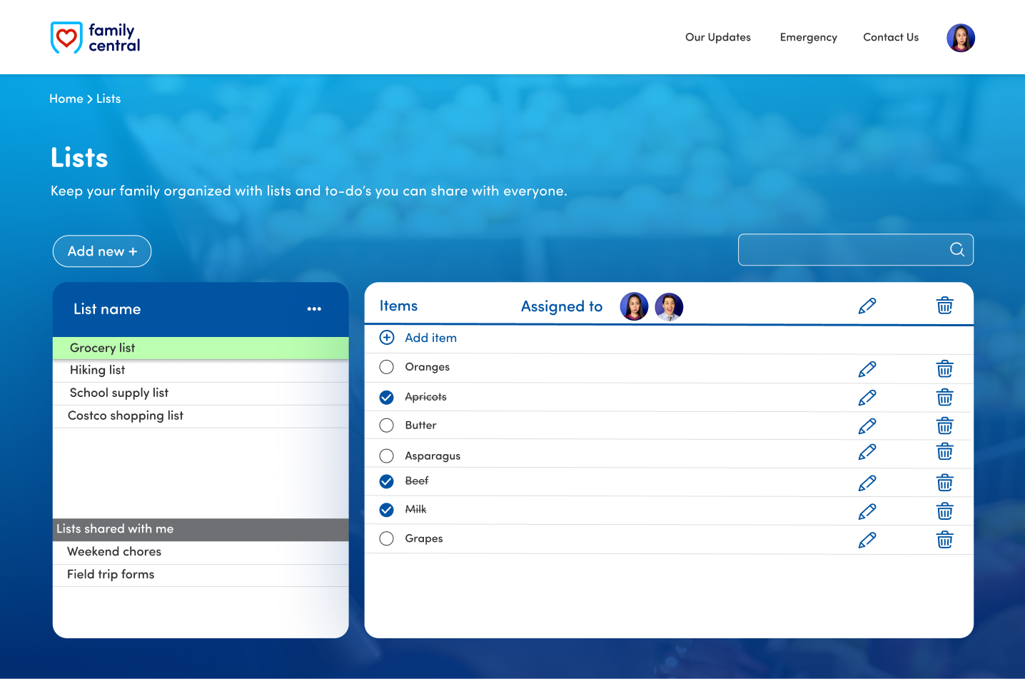
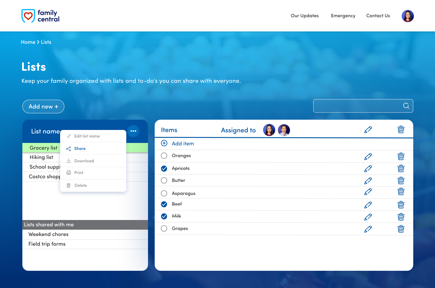
NEW: The list is checked to confirm selection and shows you which one is open. It looks more like a list, with the add item CTA moved to the top (new things are usually added up top). Items marked done are crossed out (just like a real handwritten list) with a check and colored-in bullet for a satisfying user experience.

User Testing
What Users Thought



Insights
The actual list need to be bigger so it does not feel cramped for the user. It would also make it easier to input more things on the list.A bigger list would mimic a real paper list better.
I can make the interface more interesting and dynamic for user satisfaction. Adding thumbnail photos on the lists and options for sharing and syncing with other members of the family would be useful.
Simplify the call-to-actions even more for an efficient user experience and it would help clean up the interface as well. Putting some in a menu would condense it and clean it up well.

Final iteration
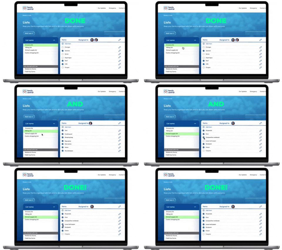
Implemented improvements
UI
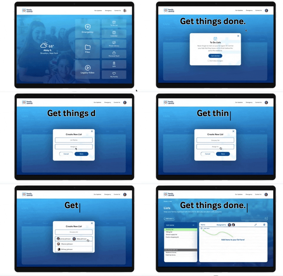
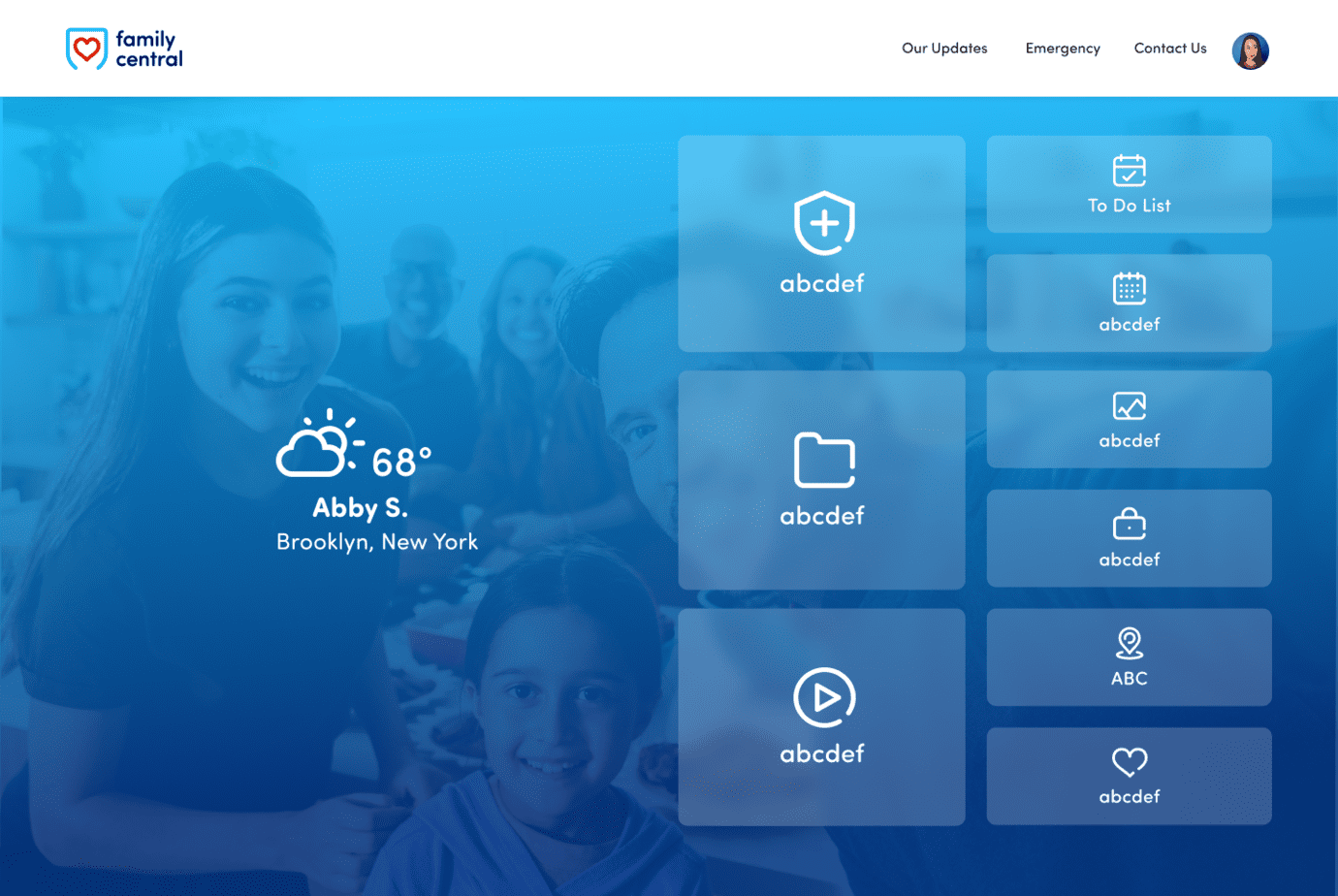
Adding interest on the screen like a family photo in the background of the home page made the app more engaging and pleasant to use. Cleaning up the screens by providing clear icons, clean and efficient CTA buttons, and form boxes made navigating easier for users.
UX
Making the UX more efficient by adding pop-ups that provide instructions and options allowed users to click on new pages less, making it easier and faster to complete the task they need. The dynamism of the lists makes it engaging but also feel familiar with working like a hand written list.
Features
Adding useful features like being able to share your list with other members of the family, and being able to print or download lists is helpful for the user to be productive and complete their set tasks with the app.
Next steps
Design Improvements
Keeping the screens efficient and simple, with as less clicks as possible. Adding pages or infinite scroll when list items get longer.
Features
Helpful features like syncing to the device's calendar automatically, adding an alarm for reminders, and saving or archiving lists.
User Testing
Doing a bigger user testing with future iterations to continue discovering pain points that can be addressed and zoning in on the market better.
